#I added a (cleaner) screenshot of the sign
Explore tagged Tumblr posts
Text
Richarlyson: [ What happened? ]
Roier: Richarlyson, I'll tell you what happened, ok? I'll tell you what happened. What happened is... Quackity was murdered, he was murdered by Maximus and Badboy because they thought it was the best decision, but...
Son, sincerely, I don't think it was, because Quackity is now very angry, and we know that Quackity is– well, I know at least, that this Quackity is not my carnal, he's not the friend I know. Everything is very strange.
Richarlyson: [ Is pa Quacks dangerous? ]
Roier: I think that right now he is, that's why I was going along with him, because... I had this feeling that maybe it was actually him. You know? But now, with the way everything has happened…
Richarlyson: [ Like a friendly feeling? ]
Roier: Yes. It kind of felt like it was him and everything was fine, and we were friends– and we are! But now he's mad, and I don't know what he's planning to do. I'm afraid for your life, and everyone else's, because everything is surely going to go to hell. I'm sorry Richarlyson. It's hard.
Richarlyson: [ I'll be fine, pa. I have you and my other papas on my side. ]

#Roier#Richarlyson#QSMP#SO if you missed today's stream this clip is a good TLDR of the major event that happened IMO#Carnal means friend but it's closer than friend#Best friend doesn't feel like the right way to phrase that either though#Also I think it's interesting that Roier doesn't call him ElQuackity#just Quackity#The bit where Richarlyson says that last line got cut off I just realized MY BAD#I added a (cleaner) screenshot of the sign#August 4 2023
216 notes
·
View notes
Text
Some tips for The Sims 3 Buy/Build
Install LazyDuchess’ Smooth Patch to alleviate lag, esp in Buy/Build and CAS.
Keep your CC merged and organized, esp your patterns, this will also alleviate a lotta lag across all modes.
When building on community lots, or any lot rlly, avoid going to the edit world menu, and just put testingcheats enabled into the cheat window, then shift+click the ground of the lot to enter Buy/Build mode. This makes leaving it to save a lot easier, with less “preparing” screens to possibly get hung up in.
Lower your settings, you don’t need any adjacent lots loaded, and you certainly don’t need super water on either. You can always switch these back on when you’re done.
While you’re at it, remove your HQ mod, and turn off your Reshade/Gshade preset, or at least turn off your depth shaders. I only ever turn on my depth shaders when I’m taking screenshots for better fps while playing. The DoF shader esp requires a lotta resources your game could be using to simulate all those 78 townie sims instead.
Save as… vs Save, I Save as… at least every third save. It’s also just good habit to keep backups.
When using the CASt tool, set down everything you plan to CASt first, then switch to a category like the wall tool to avoid eventual lag and drag when using it a lot. Love yourself. You don’t have to suffer using CASt tool in an overpopulated category like misc deco.
Utilize the clone option through testing cheats to duplicate already CASted objects, it’ll keep your design just like the dropper tool, but it’s a lot less time consuming, I promise.
Don’t be afraid to use the swatch save tool for objects you use often, esp community lot objects, as it helps to keep your aesthetic consistent. I also keep all of my favorite streetlamps, benches, and public trash bins etc in a convenient custom collection folder to speed up the process of doing multiple lots in one sitting. These handy tools are there, use them.
The issue with custom counters. They mess up sometimes, if you can’t recolor it suddenly, here’s how to fix that. Now if you can’t place down a cupboard suddenly, even though nothing’s in the way, and you’ve got moveobjects on activated, try putting it on the wall a tile over, and then try adding it to your desired spot again. Lastly if you set down counters or cupboards at a corner, and it messes up the textures, but you can still recolor it, you could do what the video I linked above does, or you could simply pull out the CASt tool, and switch it back to any of its original swatches and click the check, then feel free to recolor it as you want.
Railings will also do the “can’t recolor” trick too, but this is a simple fix, just delete it, and replace it, and you’re good.
“Oh no, I switched between buy and build mode, and now my catalogue won’t load, and I can’t click on anything at all!” Don’t panic, hit F2 and/or F3 on your keyboard, these are shortcuts for switching between them, and if you’re lucky it’ll load properly again. Should you get the bug where you load a category and it’s somehow empty, don’t fret, just click on a different category and this should fix it. Then if you get the bug where all the objects you put down disappear suddenly, sorry your game is haunted. Call an exorcist, or just reload, they might reappear if you do.
Tbh, if you run into any kind of major bugs, it’s likely a sign to either save immediately or just restart your game. These only ever show up when you’ve been at it a while ( at least for me ), therefore starting fresh wouldn’t hurt. Probably also wouldn’t hurt to check whether you might’ve installed something the game didn’t agree with by running Dashboard, or put it through the ol’ Save Cleaner.
Honorable Mention: Keep an eye on the texture sizes and poly counts of objects. I know it’s tempting to build these ultra hyperrealistic lots with clutter at every inch, but unless you’re just doing it for screenshots, or for your story, or using it very sparingly, it is not by any means recommended purely for gameplay. This is just the truth when it comes to any Sims game. You don’t want lag, or max memory crashes, or save errors? The Sims 3 is a 32bit game, that’s almost old enough to drive, be easy on it.
478 notes
·
View notes
Text
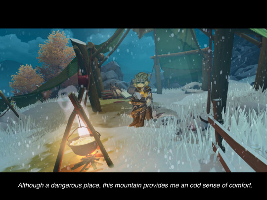


Sadbedo sitting at a camp in Dragonspine
Stress relief piece that I finished the next day.
Drafted on 08-08-2022. 2:22 AM. I’m calmer now.
art and writing process utc.
Drawing Albedo in full took some time BECAUSE OF ALL THE DETAILS ON THIS MAN but it’s fine. I’m slowly getting used to his design! His boots are kind of funky…
Drawing Albedo in full took some time BECAUSE OF ALL THE DETAILS ON THIS MAN but it’s fine. I’m slowly getting used to his design! His boots are kind of funky…
Anyway my process here was basically pose sketch > cleaner sketch > base colours (all on top of a screen layer because the screenshot was too dark to see things clearly)

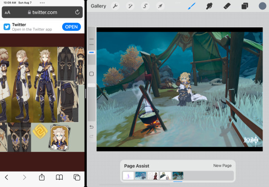
And then the fun part. AMBIENCE.
I made the glow of the fire to be warmer and brighter since I wanted more warm colours (and for Albedo to stare into a fire, whatever underlying message that might imply, haha…)
My layers look like this
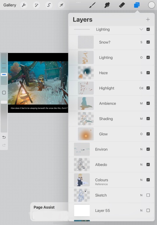
But I think for this first one the airbrushed orange colour on the “haze” screen layer was too strong so the light on the boots ended up too hazy for my preference (not shiny enough). Must’ve added shading to bring out the form instead of just the overlay lighting with airbrush… The highlights on colour dodge make the gloves and boots look more shiny which is nice. I also added some teal behind Albedo so the background isn’t too dark and has a softer look.
By now I’ve also added a snow layer. Originally I tried using motion blur on the snow but then it looked like Albedo was stranded in a snowstorm instead of just sitting there, reflecting and being sad. It’s… a Contemplation in Snow you could say lmao
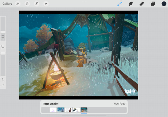
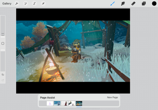
And finally, the dialogue, because I love writing dialogues. Let’s see… Technical stuff aside, I went to Dragonspine for comfort, a change of scenery, and for some nice music (I know the region’s OSTs so well I can almost name each over world track by ear lmao)
“Although a dangerous place, this mountain provides me an odd sense of comfort.”
“I suppose you can call it an escape from life’s… complexities.”
“How does it feel to be sleeping beneath the snow like this, Durin?”
Since this was meant for stress relief due to personal reasons, the first two lines reflect my feelings directly for Dragonspine. Now, the line about Durin was meant to show a sort of emotional (?) connection Albedo has with Durin, and hinting at him worrying that he might die on the mountain under maybe the Traveler’s blade. (“If one day I lose control…” Y’know how it goes.)
Out of the three lines, I came up with this line first, actually... Metaphorically speaking, it’s about my… loneliness? It’s rare for me to find people in my friend circle that enjoy media and/or literary analysis on this stuff, so sometimes I feel this way. (But not to such a dark extent, of course!)
Other lines I had considered were something along the lines of a physical report (something I do when I’m nervous, for example checking my pulse) like,
“Breathing: Difficult. Heartbeat: Escalating.”
“How should I return these vital signs to normal, exactly?”
But since it was originally just meant to be a self-indulgent “project onto Albedo because I’m sad” thing, I decided to go the usual way of feelings and metaphors… Me talking about my art process does sound rather analytical but trust me when I say my poetry is filled with extended metaphors. (You can find more of them on IG under the same handle.)
Thank you for reading this! I enjoy talking about my thought process for my artworks and written works just as much as I do for translation, if not more. With that said, please take care.
10 notes
·
View notes
Text

Road Signs
Our first photography workshop was to photograph a range of road signs, but we weren’t told what we would be doing with them. From here, we explored the town, taking images of road signs and buildings which may be of use.
When we returned to the classroom, we were told we would first be producing a topology of signs, and after that we were to produce a ‘landmark’ collage using the images we had collected, influenced by artist Nelson Figuerado, his work can be seen below.

Upon continuing to research Figuerado’s work, I came across a similar artist, Brian Hubble, who’s work can be seen below.

I much preferred his work, due to the lack of colour schemes and more recognisable imagery as oppose to so many layers. From here, I made a contact sheet and chose which images worked best to use in my collage, before opening them up in photoshop, ready to begin making layers.
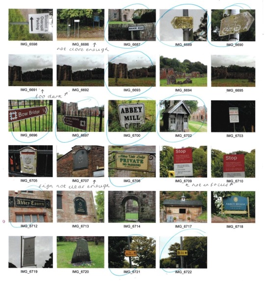
Firstly, I opened an image of the Abbey, which I had taken on my journey around the town. I removed the background and ground beneath, but left the trees behind to add depth. Next, I added a new layer, which was a scan of my homemade paper, to add a worn, decrepit texture to reflect the history behind the building itself.

From here, I created a new layer, and imported all of the images I collected of roadsigns. I tried to keep the lighter coloured road signs in the centre, as I knew this would be the centre of the image when the layers were merged later on. Next, I added a white rectangle layer, and altered the opacity to be much lower, producing a fog over the signpost background. Then, I added this layer into the background of the textured Abbey building, to reflect the clouds in a more abstract way.
I was unsure where to go from here, and as I didn’t find it as effective as I had hoped, I therefore decided to start afresh. I began with the same plan, importing the image of the Abbey as a starting point.

Then, I opened a new document in Photoshop and imported the dark coloured signpost images, as I wanted them to be similarly coloured to the building itself. I then layered and resized them in the correct place on top of the building image, and once I was happy with the placement moved that layer beneath the building layer. I then lowered the opacity of the building to 73%, which allowed me to see the signposts beneath the building, but softly. I then removed any areas of the signpost layer which didn’t fit inside the building itself, using the quick selection tool, which meant the cloud was left clean.
I altered the levels of the signpost layer, and altered the contrast of the building, allowing it to be soft, but still quite bold. I was pleased with this outcome, and felt that although originally I had planned to do the same with the clouds, I felt that leaving them as the original image as oppose to filling them with layers made it look a lot cleaner and professional overall, so left this as finished.

I felt that this was a learning curve for me, as this abstract Photoshop layering isn’t something I have used before. Although I felt my first attempt was a disaster, in the end I was pleased with my more minimalistic, softer result, and therefore if I were to do this again I would try to stay in this region, as I felt it worked best.
Aperture
Aperture is the opening of the lens and the amount of light being let in. The larger the f stop number, the less light is being let in due to a smaller opening of the lens. The smaller the f stop number, the more light is being let in due to the larger lens opening. Using the ‘Av’ option on my Canon 700D, I am able to alter the aperture, whilst the shutterspeed is automatically altered accordingly.Depth of field is the amount of the shot that is in focus, with a large depth of field meaning all or the majority of the shot is in focus, whilst a small depth of field means only part of the image will be in focus, with the rest of the background blurred. Large aperture increases the depth of field, and a smaller aperture gives a larger depth of field. To break it down simply for reference:
Larger f stop number - smaller opening, smaller aperture, larger depth of field (majority in focus).
Smaller f stop number - larger opening, larger aperture, smaller depth of field (background blurred).

Above, the first image has a large aperture (lower number - 5.6), with a shallow depth of field, blurring the background, with the same again on the three images below.

Below, the first image has a large aperture as described above, blurring the background and surrounding bottles, while the second image has a small aperture (larger number - 16), giving a wider depth of field and allowing everything to be in focus.


Shutterspeed
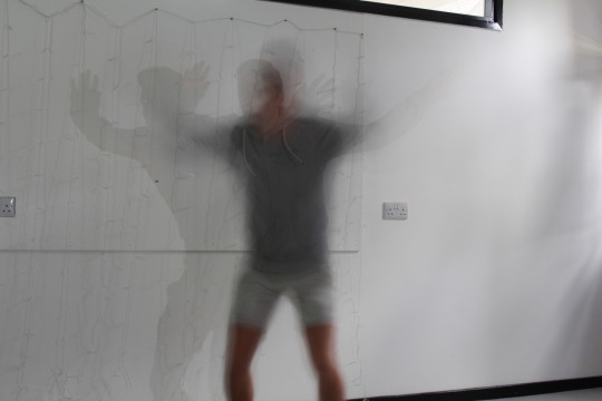
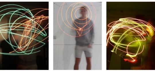
Shutterspeed is the amount of time the shutter is open. On my Canon 700D, using the ‘Tv’ option allows me to alter the shutterspeed, with the aperture being automatically set accordingly. The smaller the fraction, the faster the shutterspeed, which will photograph the motion paused/still, with no blur and no movement, meaning splashes of water can be captured sharply. The larger the fraction, or whole number, the more movement and blur is captured; which means drawing with light can be captured perfectly using a slow shutterspeed.
I have included my annotated contact sheet of both my shutterspeed and aperture images below.
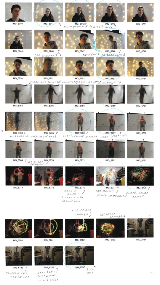
The below image was captured using a very slow shutterspeed at 5″.
Again, the below images were captured using a very slow shutterspeed at 6″, allowing the light drawing to be photographed both in well lit surroundings and in the dark room.
Pinhole Camera - Justin Quinnell - Artist Research
Justin Quinnell is a pin hole photographer, who produces strange and wacky images using the pin hole camera technique. This technique allows him to produce images like the one of SS Great Britain in Bristol, seen directly below; which was done as part of his collection of ‘Solargraphs’, which all use 3-6 month duration exposures, giving the background effect of the swirls of light.
These aren’t my favourite pieces of his work, however, instead I much prefer his collection ‘Mouthpiece’, in which the pinhole images are used by placing the camera in his mouth. Whilst these images, seen below, are weird and something I’ve never seen done before, I think the subjects of these particular images give a warm, nostalgic aura for the viewer, and whilst they are contemporary and strange, I love that they juxtapose with the very traditional and old fashioned method of using the pinhole camera, which I think makes the images all the more effective.
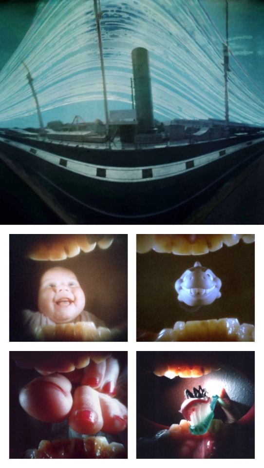
I am very pleased to have been introduced to Quinnell’s work, and his images have inspired to produce pin hole camera images of different varieties, which will be seen in my development.
Pinhole Camera
After researching Justin Quinnell, we were then to create and use our own pinhole cameras. These can allow up to 6 month exposure times, catching the lines of the sun moving across the sky.To produce our cameras, we used the instructions linked on Quinnell’s site; which were as follows:
Get an aluminium drink can.
Cut the top off with a can opener and sand the top edge using sanding paper.
Cut an 80mm x 210mm strip of black card, adding cut notches along the long edge and creasing them over.
Cut a circle of card to cover the top of the can.
Turn the can over and tape the card strip tightly around the can.
Fold over the notches and place the circle of card on top, then use duct tape to cover the lid.
The lid is then finished, and can be taken off and placed on the open end of the can.
Then, add a hole using a pin half way up the can. Fold a piece of electrical tape over the hole as a make shift shutter.
Finally, go to the dark room and be in red light. Take the lid off the camera, insert photographic paper, and allow the gap between the two edges of the paper to be where the pinhole is.From here, with the pinhole still covered with tape and the lid back on, we were able to go wherever and use our cameras.
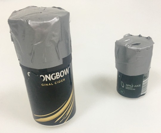
My first pinhole image can be seen both as the developed image and as the inverted image below. This was done indoors and was over exposed.


My second attempt at pinhole photography can be seen below, this time I was much more pleased with the outcome...
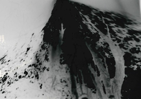
When my pinhole image was inverted in Photoshop, the outcome can be seen below. I had my exposure time just right, (12 seconds outside), however the camera was positioned too high up and therefore only caught the top of my subject’s head, but still got the surrounding trees.
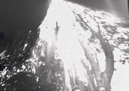
I would most definitely love to try the pinhole photography process again in my further development, as I loved the developing process and unpredictability of results.
Black and White Film
For our next photography workshop, we were introduced to the world of film photography. In this workshop, we were taught how to use the film camera, explained how to think about our images beforehand due to the limit of film rolls, and then taught how to load the film and develop it in the darkroom.Firstly, I made a Pinterest Board of inspiration, where I realised portraits of wrinkly faces and close ups of architecture were my favourites of people’s outcomes. I also explored the Instagram hashtag ‘film is not dead’ and screenshotted my favourite black and white photographs from other photographers and artists; which I have inserted below.
nickexposed - “The Last Best Place”

cmchappuis

latolome - Dollhouse

In doing so, I also thought about previous images I had taken and whether they would be appropriate locations to take black and white film images. I added monochrome filters to my favourites, with the one pictured below being the best and most effective, therefore I added this to my list of locations; scanned in below.


From here, I visited my locations, shooting at each one. Once I had used all 36, I returned to college to develop my images in the dark bag. First, we had to load the film onto the reel. Once we had loaded the film onto the roll, we then had to place the reel inside the developing tank, ensuring it was properly shut and wouldn’t allow any light in. Then, we were ready to develop the images, using the following process, but in the developing tank as oppose to in the trays.
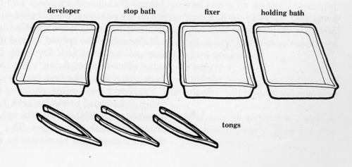
Step 1 - Developer: The developer causes the exposed areas of film to turn black. Areas that weren’t exposed will stay clear, and the areas which were only slightly exposed will turn grey. This takes 12 minutes and the container needs to be constantly turned and moved so that the developer hits all areas of the film equally. Step 2 - Stop Bath: This stops the developing process and only takes about 2 minutes. Again, the tank needs to be constantly moved. Step 3 - Fixer: The fixer makes the image on the film permanent, and takes about 5 minutes. Again, the container needs to be constantly turned and moved. Finally, the paper/film needs to be placed in water for a minute to remove all the chemicals from the paper. The film is then hung up for an hour to dry.Once dry, the film is then split and cut into strips of 6; doing so makes it easier to store and use. Then, the strips of 6 are placed into the holder to make a contact sheet with.To make the contact sheet of images, once in the holder, we then hold the glass case under the enlarger and make sure the light will hit all areas of the case. Next, all the lights are turned off and the photography paper is put beneath the film in the case. The enlarger is run for 0.5 seconds to expose light through the film, and then the contact sheet is put through the developing process explained above. Once done, the contact sheet is complete and can be left to dry before scanning into the computer and used to determine which images will be used to produce prints from.
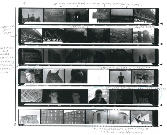
After making a contact sheet and choosing which images worked best, it was time to make a print using the enlarger and photographic paper. To do so, we inserted the film into the enlarger, and used a test strip beneath the enlarger, covering ¾ of the strip with our hand. We then allowed the enlarger to run for 0.5 seconds, and moved our hand further down the strip, now covering ½ of the strip, and allowing it to run for another 0.5 seconds. This means the first exposed section has now been exposed for a second, whilst the second section has only been exposed for half a second. We continue this process another two times with this strip, and from here we are able to see whether one of those exposure times works perfectly, or whether it needs to be exposed for even less than 0.5 seconds, in which we then try another test strip.

The enlarging tester strip above uses 0.5 secs for each square, left to right.

The second enlarging tester strip above uses 0.2 secs for each square, right to left, then below is the final enlarged print; exposed for 0.6 secs but in hindsight probably needed 0.8/1 seconds exposure.
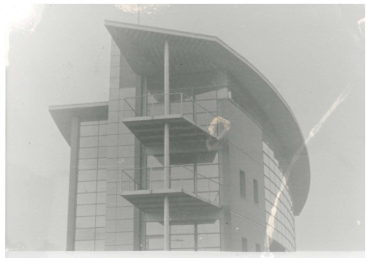
Below is a tester strip for a second print, using 0.2 secs exposure for each square, left to right.

Below is the final enlarged image, exposed for 1 second, yet in hindsight could’ve been exposed for 1.2 secs.

Portraiture
Portraits can be used to convey a multitude of emotions, and capture compositions, lighting, props and costume. Light can be used in portrait photography in different ways; with artificial light being added, and light being subtracted to produce shadows. Reflectors are used to reflect the main source of light into shadow areas; softening the main lighting source. A reflector can be a flat white board, stretched sheets of white fabric, or even just a white sheet of paper.
For our portrait photography workshop, we were set the task of producing a range of portraits using the following starting points:
Dramatic light - black and white
Two people interacting
Formal portrait
Informal portrait (considering props, costume, lighting and setting)
Fun image
Fun Portrait
I began each photoshoot by annotating a contact sheet of inspiration images on Pinterest, seen under each heading below. Then, once I’d chosen which I felt were more effective, I went on to take my images.

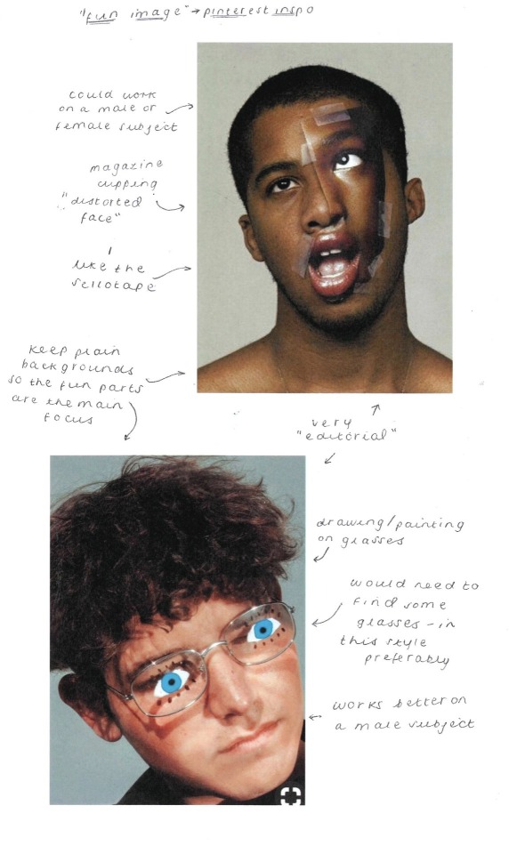
Below is an annotated contact sheet of my fun/creative images, in which I went with painting eyes on a pair of glasses and getting my subject to wear them for the images, both in and out of character.
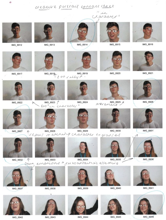

As noticed in my inspiration images, the glasses appeared most effective on my male subject, particularly whilst my subjects were being themselves, as oppose to being in character.


Whilst taking these images, I also experimented with a sheet of wire mesh. I first began using it as a screen, but soon realised that it not only was giving me texture, it was also producing light flares of colour. Whilst these two images weren’t my original intentions, I also felt that these fit under the creative portrait category, and am pleased with their outcome.


Self Portrait
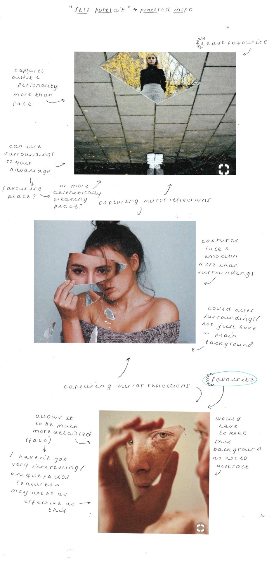
Informal Portrait
Likewise, I began with an annotated inspiration sheet from Pinterest for the informal portraits. Here, I felt that playing with light worked most effectively, and whilst the water and bath images were beautiful, they would require a striking subject.
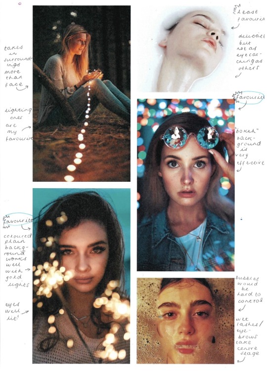
Below are my annotated contact sheets of my informal portraits. I decided to try the bokeh technique, as I felt this was the most effective from my inspiration sheet, however I had never done this before and wasn’t sure how. Andy talked me through it, and whilst I knew the aperture had to be on a low number to allow the background to be blurred, I didn’t realise the subject had to be as close as possible to the camera. Once I had this explained to me, I was then able to take my fairy lights to the photography studio and take my images.
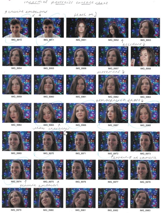
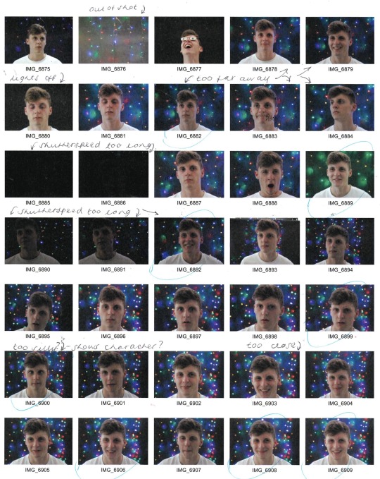
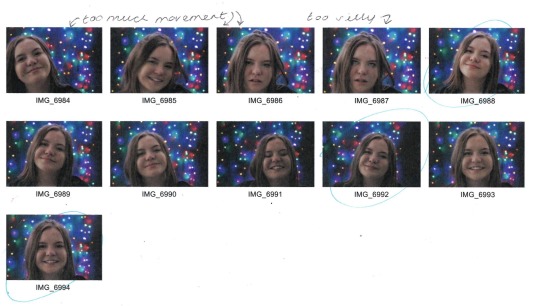
I was very surprised at how effective the images were, and was extremely pleased with my outcome. I chose my best three images to be displayed as a triptych, which all captured people mid laugh, and I felt this raw emotion gave a considerably better portrait image than any of the posed ones.

Black and White Dramatic Portrait
I realised from my annotated inspiration sheet, seen below, that the most effective black and white portraits were those with shockingly stark contrast.
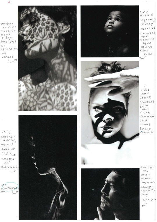
I played with this idea, seen in my contact sheet below, using softboxes to add light to certain areas of the face, and eventually using a filament bulb, which worked considerably better.
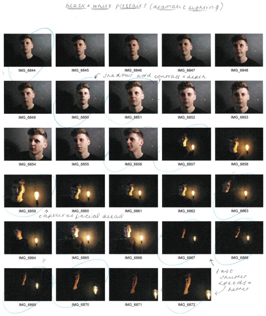
My favourite outcomes from this shoot are seen below, edited to remove the colour and up the contrast. I think these images are extremely effective, and I would like to experiment more with black and white imagery and heavy dramatic lighting in the future.


Formal Portrait
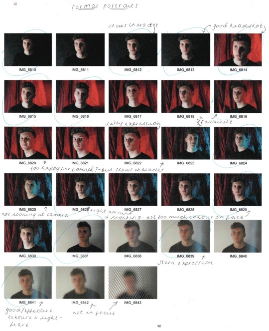
I didn’t produce an annotated inspiration sheet for the formal portraits, as I knew that these just had to be plain and simple, with a posed subject, however I knew that I still wanted to play with light and background colours. Below is my annotated contact sheet, where I decided headshots worked best, especially those without any coloured lighting hitting the face. Shadows (produced with the use of a softbox) worked extremely well, and whilst I felt the serious images were effective, I preferred the ones with a smile as I liked the character they portrayed.


Abstract Photography
Our next photography workshop was to explore shape, form, colour and texture in an abstract style. Using a camera, we were to photograph textures and abstract shapes, zooming in to get closeups and macro shots. We were then to edit and alter the images in photoshop, using layer opacity, layer blending, filters, select/cut/erase/duplicate, hue/saturation/threshold, warp/distort/skew.
Some artists that use abstract photography techniques are Kim Keever, Bill Brandt, Russell Tomlin and James R Page.
Kim Keever - Keever ‘paints with water’, producing landscape and abstract images by ‘dispersing paint through the water adding a certain character to the constructed landscape in the tank and a high degree of randomness to the abstract images’. I love Keever’s work as it is beautifully delicate and fluid, and I feel that the colour palette he uses throughout really adds to this delicate and peaceful aura, making it more effective.

Russell Tomlin - He says his ‘work in photography is driven by the details that emerge from the visual aesthetic I encounter when looking at and into water in its various forms—still water, flowing water, rain or snow, fog and cloud’. While I love the fluidity of his work, I don’t find the colour schemes as effective and calming as Keever’s, but I believe this is due to Tomlin’s editing process as oppose to dispersing actual colours of paint through the water like Keever does.

I will be using the influence of these artists to take my own abstract images and produce my own edited, layered pieces.
I took 10-20 images, using my knowledge of aperture particularly, then annotated the contact sheet, seen below. The most effective images were those of much closer textures, taken in macro mode.
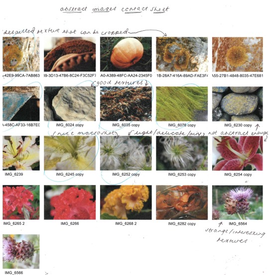
From here, I began to edit and layer the most effective images in Photoshop, the images I produced with their corresponding layers can be seen below.
The four edits below are done by changing between using two, three and four layers, as well as altering the blending modes but keeping opacities to 100%.
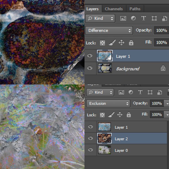
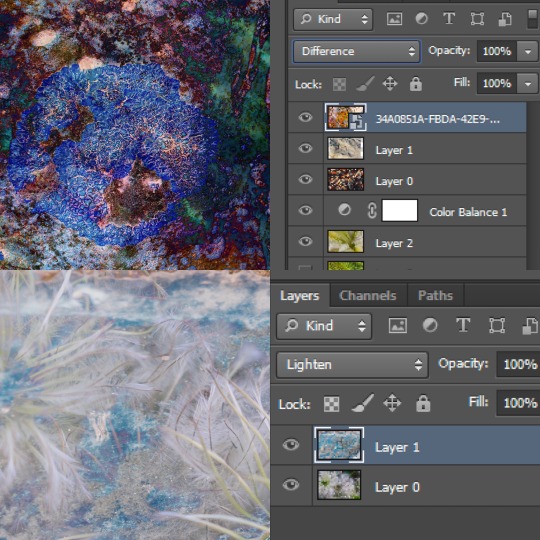
The 4 images below are edited by changing between using two and three layers as well as altering the blending modes but keeping opacities to 100% and keeping layers in the same order.
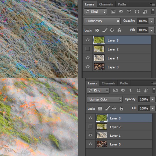
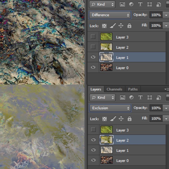
The five images below are done using all four layers and adding two colour balance layers.
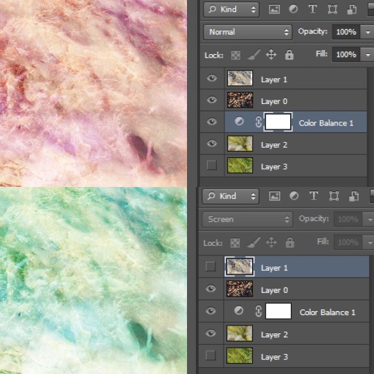
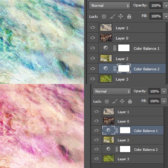
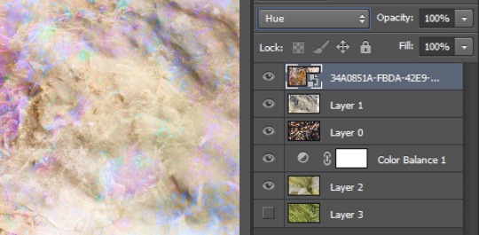
Then, I annotated a contact sheet of the final edits, choosing the edits I felt to be most effective; which in this case were the more delicate, fluid abstract images, reflective of Keever’s work which I previously explored.
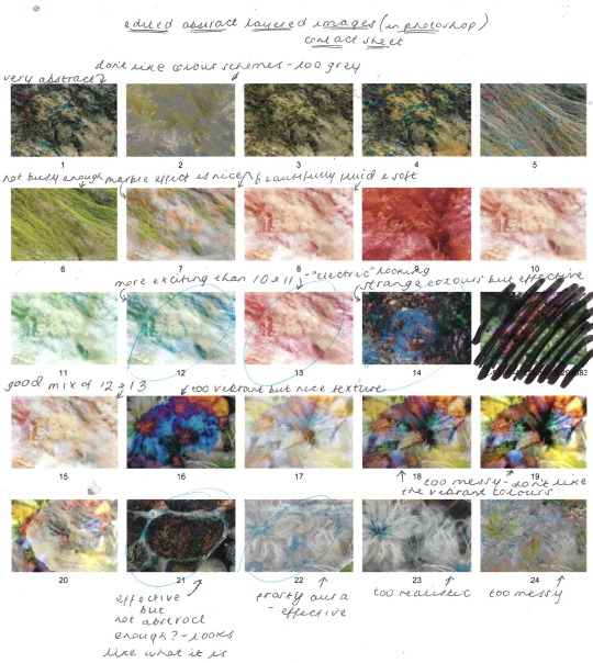
I whittled these edits down to the best six, then annotated these below, explaining what layering techniques were most effective and which initial images were included in each process.
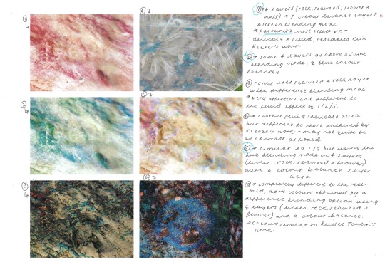
From here, I chose my favourite and most effective abstract image, which again is very similar to Keever’s style, but has a more “electric” addition, from my own experimenting.

1 note
·
View note
Text
Dolphin Emulator Mac Download

Dolphin is a Gamecube and Wii emulator. Most games run perfectly or with minor bugs. Games are playable at HD quality, up to 1080p. This is a remarkable feature the actual Gamecube and Wii. This free software for Mac OS X is an intellectual property of Dolphin Team. The unique ID for this application's bundle is com.dolphin-emulator.dolphin.
Dolphin Emulator Mac Download For Windows 7
Dolphin 3.0 Download
Dolphin Emulator For Mac Download
Dolphin Emulator for Mac Free Download: Dolphin Emulator for Mac is an excellent video game console emulator with which you can play GameCube and the Wii. Dolphin Emulator Mac PC app is a cross-platform open-source emulator that supports playing Nintendo catalogue of games. It is also the first GameCube emulator with which you can successfully run commercial games from Mac desktop. With the Dolphin Emulator for Mac, you can let enjoy the Nintendo games for the two consoles namely GameCube and Wii in full HD. Those who love playing games on these consoles can opt for this emulator with various enhancements like the compatibility with all PC controllers, networked multiplayer, turbo speed, and more. In most cases, the game players will let enjoy better graphics than in the real video consoles. Dolphin Emulator PC Mac app is an open-source project in which everyone can commit for more improvements. It can save a running game whenever you want it and will reload a state on the go instantly. Dmg northampton.
Download the latest version of the Dolphin Emulator (5.0-11084) from the official website. Dolphin Emulator started solely as a GameCube emulator, focused only on the one console. But, when the Wii was released and it was discovered to have hardware almost identical to its older sibling, Dolphin Emulator naturally evolved into a GameCube and Wii emulator.
Download Dolphin Emulator app for Mac PC as it is developed actively and new features are added almost every day and the bugs are fixed. It is a multiplatform project and which lets you use the real GameCube controllers via the use of a USB adapter and the Wii Remotes through the Bluetooth connection. You can even connect the Wiimote and Nunchuck to your Mac PC for a better gaming experience as with this emulator. There are two kinds of network play supported by this emulator and that includes the emulated local multiplayer and Nintendo Wi-Fi Connection. The former one works only with the Dolphin users and that can be used on the games that by default have no online playing option. The second kind is for the online gameplay for the WFC supported Wii games with other Dolphin users and the real Wii users. All the game progress are saved on the virtual GameCube Memory Cards that are emulated with flash memory. The emulator also features a Memory Card Manager that lets you transfer or save files to and from the virtual GameCube memory cards.
Dmg dual spindle cnc lathe parts. Visit your nearest DMG MORI Solution Center (Showroom).
Dolphin Emulator for Mac – Specifications
Application Name: Dolphin Emulator Developer: Dolphin Emulator Project Version: 5.0-8952 Categories: Tools Languages: Multiple Languages File size: 24.9 MB
Features of Dolphin Emulator Mac
The salient features of Dolphin Emulator Mac Download are listed below
Video Game Console Emulator: Download Dolphin Emulator appfor Mac PC as is the best video game console, emulator. With this, you can play two recent Nintendo video game consoles called the GameCube and the Wii.
Cross-Platform Emulator: It is a cross-platform emulator that is also an open-source Gamecube and Wii emulator. You will be getting the ability to play the games with improved graphics over the original consoles.
Play in High Definition: You can play on the maximum resolution in the high definition up to 1080p. It is a remarkable feature as with this emulator which when compared with the original Wii console.
Network Play: Dolphin Emulator PC Mac app supports two different kinds of network play. It is called as the Emulated local multiplayer and the Nintendo Wi-Fi Connection.
https://universallytreepeace.tumblr.com/post/640537553635786752/macos-sierra-dmg-file. But, I will keep at it.
Save & Reload Games: You can easily save the game progress in the virtual GameCube Memory Cards that are emulated the Wii flash memory, and save the states. With this Emulator will also reload the game at any time. https://universallytreepeace.tumblr.com/post/641268726813081600/which-is-the-newest-mac-cc-cleaner.
Need to download some YouTube videos to keep the kids quiet, or just want to stop streaming, here's how to save YouTube videos to your Mac. We look at the best free and paid for YouTube. This blog post shows you a FREE method to download YouTube videos on your Mac with simple clicks. No matter you are using Chrome or Safari on your Mac, you can save YouTube videos to your Mac using the way introduced in this blog post. Download Video from 1000+ Video Sites. One of the software's greatest talents is the ability to capture videos (MP4, MKV) and audios (MP3, AAC) from over 1000 sites, be it YouTube, Break, Flickr, Facebook, Metacafe, Veoh, ESPN, MTV, Audiomack, etc. How to download youtube videos mac free. Aug 26, 2016 MacX YouTube Downloader is a great free online video/audio downloader for Mac OS that can download music and videos from over 300 online video sites. While many want to download YouTube videos, the only way to do so responsibly is on iOS and Android, by paying the $11.99 for YouTube Premium. Otherwise, you're violating YouTube's terms of.
Related Apps of Dolphin Emulator for Mac
SideSync for Mac is an outstanding connectivity app with which you can easily share the screens or data between PC and mobile.
Nintendo DS Emulator for Mac is an amazing and one of the most popular handheld consoles for playing the Nintendo games.
Nox App Player for Mac is an excellent Android emulator with which you can easily play mobile games on the desktop PC.
vShare for Mac is one of the third-party app store available in the market with which you can access several hundreds of apps.
VMware for Mac is a unique tool that will let you run Windows and other operating systems alongside Mac OS without any reboot.
Download Dolphin Emulator for Mac

Dolphin Emulator Mac Download For Windows 7
Dolphin Emulator app is compatible with the Mac version of 10.09 and later.
Click here to Download Dolphin Emulator for Mac

Techniques To Download Dolphin Emulator on Your Mac PC
Technique One: The first technique to download Dolphin Emulator Mac app on your Mac PC is very simple. You must click on above given “Download Link.” Once you click on the link, the Dolphin Emulator app will get downloaded and installed automatically on our Mac PC. Dolphin Emulator Mac Download via this technique is the most simple and easy way of getting the Dolphin Emulator app right on your Mac desktop PC. With the Dolphin Emulator Mac PC app, you can get indulged in playing a GameCube and Wii Nintendo games. It is an open-source video game console emulator with which you can save a running game and reload it any time later. You can let enjoy the games for these two consoles in the full HD of up to 1080p as with the download and installation of the Dolphin Emulator Mac PC app.
Dolphin 3.0 Download
Technique Two: The second method to download Dolphin Emulator Mac is also simple however you need some additional time to search for it and use it on your Apple iOS device. In this method, you will be getting the Dolphin Emulator app directly from its official website. Once you enter into the Dolphin Emulator app’s website, you will be able to see lots of options on the screen. In this page, you will be able to see the Download Button and just with a click to get the Dolphin Emulator app on your Mac PC. Once you click the button, the Dolphin Emulator app will get download and installed automatically on your Mac PC.
How to Download Dolphin Emulator for Mac using Bluestacks
To install and use Dolphin Emulator on MAC, you need an emulator. Bluestacks is one of the most famous and popular Android emulators which can be used to install Android apps on your MAC.
Download and install Bluestacks from its official website (www.bluestacks.com).
Open Bluestacks app and sign in with your Gmail username and password.
Open Google Play Store app which is located on the home page of Bluestacks emulator.
Search Dolphin Emulator under Google Play Store search bar.
From the resultant apps, choose the Dolphin Emulator official app and click on it.
Press Install to download and install the app.
After installation, you can launch the app from the Bluestacks home screen.
Screenshots of Dolphin Emulator
Incoming Related Searches
Dolphin Emulator For Mac Download
Dolphin Emulator for macbook Dolphin Emulator for macbook pro Download Dolphin Emulator for Mac Dolphin Emulator Mac download Dolphin Emulator Mac Free download

0 notes
Text
February 8th 2021
It might just be the time of year, but I find myself getting discouraged easily. It’s compounded by the fact that we’re coming up on a year since my job sent me home and everything that’s happened since then. The simple fact of the matter is I’m not where I want to be at almost any category of life you care to name. I’m currently making about half of what I was pre-May 2020, I’m struggling with staying in a creative mindset, I’m not necessarily hopeful that I will be able to realize a key hope of mine to regain the position I was previously in, and I’m not finding anything equivalent out there that I can do despite the experience. It leaves me in a pretty depressing place, and I’m not sure what my next move is. So when this happens, I try to move out of the mindset of what I can’t do to figure out what I can accomplish. I believe it starts with talking about the things I am passionate about. Demonstrating some knowledge. Possibly not being so unassuming about it?
A lot of the past year had to do with how my friends stayed creative and productive during the pandemic, and now I may be best served by turning this camera inward. Let’s see what happens.
After I wrote the above, I fired up my Feedly reader, and Seth Godin’s post today is very timely indeed.
So, let’s consult the imp in the back of my head that wants to know what the bleep I’m going to do to turn YET into DONE. I think first we have to define what DONE is, and I’m finding that a little hard to do at the moment. It’s a Jackson Pollack splatter of thought about what I don’t want to be doing anymore, and very little thought about what it is I would rather be doing, and whether I can do it for a living. Nothing new here, this has pretty much been the case for a few years now. I need to put these thoughts together. I don’t want to take phone calls anymore. I do want a job in a creative field. I want what I create to be able to help people. I want to be able to live comfortably on the fruits of that effort, which means not only the bills are paid, but that the wife and I are not worried about health insurance, and that the kids are taken care of.
So, maybe that’s what done is. If that’s true, then the next question—my favorite—is ‘What’s Next?”. What I’m about to write is the first time I’ve ever written this answer: I don’t know. I don’t know what the first step is, and if I don’t know what the first step is, I can’t figure the next one. Marie Forleo likes to say “Everything is Figureoutable”. I sure hope so, because being stuck in this place is a goddamn exhausting place to be.
Of course, as I said at the beginning, it could just be that it’s January and it’s cold, and that I hate everything right now. It feels like more than that, but maybe it always does and I’m not remembering it.
Oh, You Didn’t Know?
Joe Budden, who up until a few months ago had an exclusive deal with Spotify, is moving his podcast to Patreon. The Verge has some comments from Budden:
He says he proved the model, along with the potential of his audience, but didn’t want Spotify to use his fans and reach to prove the platform’s own worth and make money.
“For many years, the record labels and the system that I come from tricked us into thinking they were doing us a favor by capitalizing off our talent and basically loaning us money, and that’s been the standard the entire time,” Budden says, adding that he already knows how that system worked out for creators.
When Budden announced his split from the tech company, he said Spotify was “pillaging” his audience and only cared about how his show contributed to Spotify overall, not about his actual podcast.
Budden was a recording artist before he was a podcaster. If he’s aware that the record labels played games, I can’t believe he didn’t see the obvious. Streaming Services aren’t exactly known for treating artists differently, for a start, but let’s address what I think is the elephant in the room, which is the question of whether or not what you had was actually a podcast, because I think that question is fundamental to the problem Budden experienced. A podcast is not exclusive to a platform, and I’ll argue that point until I’m blue in the face. If I can’t subscribe to your show on a different platform than Spotify, then you don’t have a podcast, you have a show on Spotify. Spotify might have a big user base, but that user base is all you have. Spotify’s Q4 2020 earnings state that they have 345 million active monthly users, and that only 25 percent of those users listen to podcasts on the platform. That’s around 86.5 Million, and trust me, they’re not all listening to Joe Budden. Yes, he’s got a lot of downloads, but what he’s got on Spotify is all he’s going to get by staying there. Patreon is a huge and smart play, I wouldn’t be surprised if he goes 3x on listeners and money at the very least.
(Note to self, get back on Patreon, it’s about to blow up.)
The Clothes Suck Anyway
Ah, exposure. SO great for paying bills, only the complete opposite of paying bills.
One of my favorite Twitter accounts is @forexposure_txt, and they receive posts every day from creatives who receive requests, demands, and straight-up meltdowns from people who believe it’s ok not to pay a creative for their work. However, in some cases, there’s the odd post about a company that lifts a picture, alters it, and uses it on their social media without attribution. Take, for example, Meg of Margate, a photographer who discovered a fashion brand called Ted Baker (no link, I’m not enabling this behavior) lifted a photo, photoshopped it, and post it on their Instagram “for engagement”. When called on it, they offered Meg a 200 dollar gift card from their store, which she declined. They then stated they didn’t have the budget to pay photographers, so they deleted the image.
Fine, but let’s be clear about what really happened here. A fashion brand that declared revenue of 617 million pounds in 2019 used a picture that didn’t own to drive traffic to their brand. They got likes and engagement for hours on that post. Then they told the photographer, sorry we can’t afford it, and just deleted the post. Ted Baker made money off that stolen picture, and they probably will have no liability for screwing a creative because it costs money to take people to court.
If this doesn’t make you angry, it should.
This seems like a good place to link to one of my favorite talks by Mike Montiero, “Fuck You, Pay Me.”
More Instagram Stuff
Instagram is now conducting a test to remove the ability to share feed posts within Stories:
You would assume that a lot of Stories updates are re-shared feed posts. The fact that Instagram is willing to reduce this seems like a positive sign for its development focus - but it might also indicate that people are viewing Stories less as a result of such shares, which has prompted Instagram to take action.
I can tell you that many of my stories are photos from other accounts that I think are amazing, and I do that to encourage my followers to follow them. If you remove the ability for me to do that, then I have to resort to a third party program—Repost—to post them to my feed, and I don’t want to do that. My feed should be for my pictures. I hope what they’re driving at is removing the ability to share one’s own feed posts as Stories, and I would completely understand why they feel it’s redundant. That’s not how I read this story.
In other Instagram news, it looks like IG and Twitter might be burying the hatchet soon and allowing integrations again:
That's an even bigger integration. As noted by Jane Manchun Wong, Instagram hasn't provided direct Twitter integration since it disabled Twitter card preview support back in 2012, which makes it annoyingly difficult to share content between the two apps. Now, it seems they're mending bridges, which could facilitate not just tweets in Stories stickers, but wholly new integration options which would enable direct sharing of Instagram posts to Twitter as well, fully integrated and formatted in-line.
That's not part of this proposal, and it may not ever be. But it would definitely be handy - and with Twitter seemingly now more open to such, it could pave the way for improved connection.
If true, this would look a lot cleaner than the screenshots we’re all doing right now anyway. Honestly, this horse has been out of the barn so long it’s dying of exposure.
Shot of The Day
#Joe Budden#Spotify#Patreon#Ted baker#For Exposure#IG Stories#social media#Twitter#Integrations#Winter#Seasonal Depression
0 notes
Text
Assignment 3 - Commentary

Based on the forum feedback, I identified the following issues with my critique prototype:
more clarity needed for anime symbols in Top 3
the typeface used throughout should be consistent for a better look
I can make use of the visual symbols more
Based on these, I made the relevant edits. I started off with repositioning the awkward figurine and made it the central focus of the merchandise section. I did so by removing the line graph and instead representing the extreme points in the merchandise. I coloured in the amount of money made in comparison to the original amount from the first data point for easier comparison, allowing the viewer to see the drop in profit made from merchandise sales.
Next, I added labels to the extreme points to make it clearer what the value of the respective data points was.
To incorporate the existing dango icons and the box on Pressure, I added another visual symbol (Gintoki) and used his outheld hand to “hold” on to the dango. I put in the Netflix and Amazon logos in the dango to make it appear as if they are “personifying” the logos. I feel this represents the production companies balancing this pressure, leading to the increased production cost.
Finally, I made edits to the Top 3 box by changing the “Top 3″ typeface to the same as the rest of the inforgraphic. I then repositioned the logos of the anime to reflect the position of the top 3 in a podium-like arrangement. I did not add in a podium because i felt like it would be too much clutter. I feel that the reader can follow the order from Dragonball Z to Attack on Titan to Pokémon based on the height difference. I also labelled the logos to make it clearer what the anime is. I also removed the continent in the background because it has no statistics for the percentage of anime licensed and it also gives an overall cleaner look.
[FROM FORUM:]

There are no major changes from my sketch for my prototype but I tried to incorporate the feedback on colour and adding more symbols/icons to represent my data visually.
I used an off-white background to contrast my main colour scheme which is made up of blues and reds. I used the reds mainly for the map and the blues for the other boxes. I wanted an overall cool tone for my infographic because it is factual. The overseas market is the main bulk of the infographic so I wanted to highlight the map with the percentage of contracts signed. Since red is eye-catching, I decided to go with that original hue and I incorporated feedback from the tutorial to vary the shades of red on the different continents.
For the market size, while I initially had rectangles of varying size to represent the market size in my sketch, I thought that a pie chart would be easier to see the proportion at first glance. For the box below market size on increased earnings from 2017, I wanted to use the visual symbol (i.e. the upwards facing arrow) to replace “increased” but I found it difficult to position it such that the reader would immediately understand I’m trying to convey “increased 23% earnings from 2016” so I decided to add the word “increased”.
For the Top 3 background music royalties, I used only recognisable symbols from the top 3 anime. I’m not sure if I should change the title to “Top 3 Anime in Background Music Royalties” so that it is clear each symbol refers to an anime.
As for key findings in the domestic market, I only wanted to highlight the trend over 4 years. For each of the line graphs, I added the value in 2017 (which is the latest value) by lowering the opacity and changing the tone. I was not sure if it is necessary to include because the trend itself is visible on the line graphs. One concern I have is the awkward positioning of the figurine next to “Merchandise” - it looks a little odd there but I’m not sure where I can place it. If I make it too small, it is no longer clear from afar.
The following are screenshots of the layers I used:


0 notes
Text
iOS 11 is about to arrive—and here's what's in it
yahoo
If Apple’s (AAPL) usual annual schedule is any guide, then Tuesday, September 12 won’t just be the day we get new iPhone models. It will also be the day —or at least the countdown to the day—we get a new version of the iPhone system software, which will run on several years’ worth of older iPhone models. This year, it’s going to be called iOS 11.
It won’t bring you any one big-ticket feature. Instead, you’ll get a wholllllle lot of tiny nips and tucks. They seem to fall into five categories: Nice Tweaks, Storage Help, iPad Exclusives, Playing Catch-Up, Fixing Bad Design.
Here’s what you have to look forward to!
Nice Tweaks
Expectations set? OK—here’s what’s new.
A new voice for Siri. The new male and female voices sound much more like actual people.
One-handed typing. There’s a new keyboard that scoots closer to one side, for easier one-handed typing. (You can now zoom in Maps one-handed, too.)

The new one-handed keyboard.
Quicker transfer. When you get a new iPhone, you can import all your settings from the old one just by focusing the camera on the new phone on the old one’s screen.
Do not disturb while driving. This optional feature sounds like a really good one. When the phone detects that you’re driving—because it’s connected to your phone’s Bluetooth, or because the phone detects motion—it prevents any notifications (alert messages from your apps) from showing up to distract you. If someone texts you, they get an auto-response like, “I’m driving. I’ll see your message when I get where I’m going.” (You can designate certain people as VIPs; if they text the word “urgent” to you, their messages break through the blockade.)

No more distracting notifications while you’re on the road.
Improvements to Photos. The Photos app offers smarter auto-slideshows (called Memories). Among other improvements, they now play well even when you’re holding the phone upright.
Improvements to Live Photos. Live Photos are weird, three-second video clips, which Apple (AAPL) introduced in iOS 9. In iOS 11, you can now shorten one, or mute its audio, or extract a single frame from that clip to use as a still photo. The phone can also suggest a “boomerang” segment (bounces back and forth) or a loop (repeats over and over). And it has a new Slow Shutter filter, which (for example) blurs a babbling brook or stars moving across the sky, as though taken with a long exposure.
Swipe the Lock screen back down. You can now get back to your Lock screen without actually locking your iPhone—to have another look at a notification you missed, for example.
Smarter Siri. Siri does better an anticipating your next move (location, news, calendar appointments). When you’re typing, the auto-suggestions above the keyboard now offer movie names, song names, or place names that you’ve recently viewed in other apps. Auto-suggestions in Siri, too, include terms you’ve recently read. And if you book a flight or buy a ticket online, iOS offers to add it to your calendar.
AirPlay 2. If you buy speakers from Bose, Marantz, and a few other manufactures (unfortunately, not Sonos), you can use your phone to control multi-room audio. You can start the same song playing everywhere, or play different songs in different rooms.
Shared “Up Next” playlist. If you’re an Apple Music subscriber, your party guests or buddies can throw their own “what song to play next” ideas into the ring.
Screen recording. Now you can do more than just take a screenshot of what’s on your screen. You can make a video of it! Man, will that be helpful for people who teach or review phone software! (Apple didn’t say how you start the screen recording, though.)
Storage Help
Running out of room on the iPhone is a chronic problem. Apple has a few features designed to help:
Camera app. Apple is adopting new file formats for photos (HEIF, or High Efficiency Image Format) and videos (H265 or High Efficiency Video Codec), which look the same as they did before but consume only the half the space. (When you export to someone else, they convert to standard formats.)
Messages in iCloud. When you sign into any new Mac, iPhone, or iPad with your iCloud credentials, your entire texting history gets downloaded automatically. (As it is now, when you sign in on a new machine, you can’t see the Message transcript histories.) Saving the Messages history online also saves disk space on your Mac.
Storage optimization. The idea: As your phone begins to run out of space, your oldest files are quietly and automatically stored online, leaving Download icons in their places on your phone, so that you can retrieve them if you need them.
iPad Exclusives
Many of the biggest changes in iOS 11 are available only on the iPad.
Mac features. In general, the big news here is the iPad behaves much more like a Mac. For example, you can drag-and-drop pictures and text between apps. The Dock is now extensible, available from within any app, and perfect for switching apps, just as on the Mac. There’s a new Mission Control-type feature, too, for seeing what’s in your open apps—even when you’ve split the screen between pairs of apps.

The iPad now offers a “Mission Control,” showing what’s going on in all your apps.
Punctuation and letters on the same keyboard. Now, punctuation symbols appear above the letter keys. You flick down on the key to “type” the punctuation—no more having to switch keyboard layouts.

No more switching keyboards just to type punctuation.
A file manager! A new app called Files lets you work with (and search) files and folders, just as you do on the Mac or PC. It even shows your Box and Dropbox files.

A Finder–a desktop–comes at last to iOS.
Pencil features. If you’ve bought Apple’s stylus, you can tap the Lock screen and start taking notes right away. You can mark up PDFs just by starting to write on them. A new feature lets you snap a document with the iPad’s camera, which straightens and crops the page so that you can sign it or annotate it. Handwriting in the Notes app is now searchable, and you can make drawings within any Note or email message.
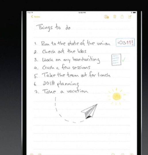
The iPad grows ever closer to becoming a legal pad.
Playing Catch-Up
With every new OS from Google (GOOG, GOOGL), Microsoft (MSFT), or Apple, there’s a set of “us, too!” features that keeps them all competitive. This time around, it’s:
Lane guidance. When you’re driving, Maps now lets you know which lane to be in for your next turn, just as Google Maps does.

Lane guidance. At last.
Indoor Maps. The Maps app can now show you floor plans for a few malls and 30 airports, just as Google Maps does.
Siri translates languages. Siri is trying to catch up to Google Assistant. For example, it can now translate phrases from English into Chinese, French, German, Italian, or Spanish. For example, you can say, “How do you say ‘Where’s the bathroom?’ in French?”
Siri understands followup questions. Siri now does better at understanding followup questions. (“Who won the World Series in 1980?” “The “Phillies.” “Who was their coach?”)
Person-to-Person payment within the Messages app. Now, you can send payments directly to your friends—your share of the pizza bill, for example—right from within the Messages app, much as people do now with Venmo, PayPal, and their its ilk. (Of course, this works only if your friends have iPhones, too.) When money comes to you, it accrues to a new, virtual Apple Pay Cash Card; from there, you can send it to your bank, buy things with it, or send it on to other people.

Send payments directly to your friends.
iCloud file sharing. Finally, you can share files you’ve stored on your iCloud Drive with other people, just as you’ve been able to do with Dropbox for years.
Fixing Bad Design
Some of the changes repair the damage Apple made to itself in iOS 10. For example:
Redesigned apps drawer in Messages. All the stuff they added to Messages last year (stickers, apps, live drawing) cluttered up the design and wound up getting ignored by lots of people. The new design is cleaner.
Redesigned Control Center. In iOS 10, Apple split up the iPhone’s quick-settings panel, called the Control Center, into two or three panels. You had to swipe sideways to find the control you wanted—taking care not to swipe sideways on one of the controls, thereby triggering it. Now it’s all on one screen again, although some of the buttons open up secondary screens of options. And it’s customizable! You can, for example, add a “Record voice memo” button to it.
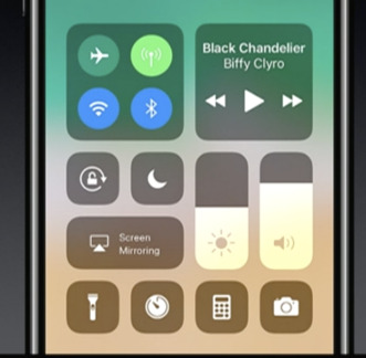
The new, customizable, somewhat ugly Control Center.
App Store. The App store gets a big redesign. One chief fix is breaking out Games into its own tab, so that game and non-game bestseller lists are kept separate.
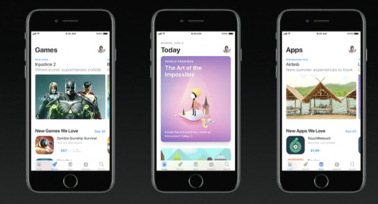
After nine years, the App Store gets a new look.
Coming very soon
There are also dozens of improvements to the features for overseas iPhones (China, Russia, India, for example). And many, many enhancements to features for the disabled (spoken captions for videos and pictures, for example).
So what’s the overarching theme of the iOS 11 upgrade?
There isn’t one. It’s just a couple hundred little fine-tunings. All of them welcome—and all of them aimed to keep you trapped within Apple’s growing ecosystem.
More from David Pogue:
MacOS High Sierra comes this fall—and brings these 23 features
T-Mobile COO: Why we make investments like free Netflix that ‘seem crazy’
How Apple’s iPhone has improved since its 2007 debut
Gulliver’s Gate is a $40 million world of miniatures in Times Square
The 5 best new features of this week’s YouTube redesign
Samsung’s Bixby voice assistant is ambitious, powerful, and half-baked
Is through-the-air charging a hoax?
David Pogue, tech columnist for Yahoo Finance, is the author of “iPhone: The Missing Manual.” He welcomes nontoxic comments in the comments section below. On the web, he’s davidpogue.com. On Twitter, he’s @pogue. On email, he’s [email protected]. You can read all his articles here, or you can sign up to get his columns by email.
#_lmsid:a077000000BAh3wAAD#_revsp:yahoofinance.com#$AAPL#_author:David Pogue#_uuid:9b33dcbf-7f4e-343c-b5f9-271cfdf12842
11 notes
·
View notes
Text
Android 9 Pie Features review
Here’s the story with every new version of Android, in a nutshell: it’s great, but you can really only get it on a phone that Google makes. Sometime next year, new phones by other companies will launch with it. The Android phone in your pocket might get it, maybe, but it’ll take longer than you want, and honestly, the new version isn’t that different, so you shouldn’t sweat it too much. Yes, fragmentation is an issue, but it’s better now than it used to be, thanks to Google’s ability to push some key updates out through the Google Play store instead of having to rely on full system updates. The story with Android 9 Pie isn’t radically different, but it changes some of those tried and true (and increasingly tired) lines a bit. For the first time, I’ve had a chance to test the official release of a new version of Android on a phone not made by Google, the Essential Phone. That’s a good sign. Although a few of the promised features aren’t shipping or are still in beta, I think this version of Android is good enough that users should demand the update for their phones. I’m not trying to organize a campaign to shake off our complacent acceptance of a terrible update status quo, but I am saying we should bring back a little bit of the old outrage at carriers, manufacturers, and Google itself. The many features in Android 9 Pie cohere into something that feels more polished than the last few versions of Android. There is a lot to like and fewer excuses than ever for updates not to come out for existing phones in a timely manner. We’ve been living with the same three-button core navigation system in Android for several years now, but with Pie, Google is finally giving a gesture-based interface a shot. It may not be the most important new feature in the OS, but it’s certainly the most prominent and the most divisive. Bear with me here because I’m going to overthink this, but I think it’s worth it because it illuminates a key point about Google’s design direction. The new system replaces the back, home, and multitasking buttons with a singular home button, gestures, and other buttons that appear on an as-needed basis. In theory, it will make future Android phones more accessible to users who are used to the iPhone X’s gesture system, and it also offers some benefits (swiping requires less accuracy than tapping). Overall, the new gesture system works, but it’s conceptually complicated.

To see what I mean, here’s a brief description of how gestures work: You swipe up once to get to an overview page. The Overview pane (aka your recently used apps) lets you swipe between apps or enable split-screen with a hidden menu on the app’s icon. On Pixel phones, you’ll also get an AI-driven list of suggested apps and a search bar. Swipe up again, and you’ll get to the app drawer with icons for all of your apps. You tap the home button to go home, or you can drag the home button to the right to quickly switch between apps in a screen that’s similar, but not identical, to the Overview screen. Along with all of this, the traditional Android back button will still show up from time to time next to the home button because Google hasn’t yet developed a gesture for “back.” It’s... a lot. I’m not against complication in principle when it comes to UX — I have faith in humanity’s ability to learn — but there’s no denying it takes some time to feel like you know your way around. The funny thing is, I think the negative reaction isn’t about how complicated gestures are. Instead, it’s about how they feel. As I’ve written before, switching to a primarily gesture-based navigation system is a risky move for Google, because those systems only feel good if they... feel good. Any “jank” in the animation or weirdness in the physics of moving elements on the screen will make a user feel unmoored and unhappy. The good news is that — at least on the Pixel 2 XL — Google finally got to a place where the animations work as they should, and the jank is gone. But the physics and ergonomics still feel a little off, especially if you’re used to the system on the iPhone X. (After a rockier beta, animations were also fine on the Essential Phone with the final version.) Where the iPhone’s gestures let you flow from one thing to the next with a single gesture, Android’s feel a little more staccato. As just one example, you theoretically have the option to do a long swipe up to get to the app drawer instead of a double swipe (once to the overview, once again to the drawer). But in practice, you have to do a loooong, loooong swipe to get it to work, which you’ll invariably get wrong, and the dock will give you a fussy little bounce in a futile attempt to indicate you should just double-swipe up. I’m overthinking all this in part because I don’t think Google thought it over enough. I would have jettisoned the long swipe and just encouraged people to double swipe. That would have the side effect of pushing people into the Overview screen more often, which would be a net good for Google. The app suggestions are very often exactly what I want and the swipe-tap motion to start a search is faster than any mobile search UX we’ve had, going on seven years (since, you guessed it, just typing on the physical keyboard of a webOS or BlackBerry phone). But, of course, that enhanced Overview screen is a Google-exclusive feature. Other phones, like the Essential phone, don’t have those Googley-bits at the bottom, they just have your app dock and no search bar. THE GESTURE SYSTEM IS AN OVERALL IMPROVEMENT, BUT IT NEEDS SOME TWEAKS With Pie, Google is leaving the buttons as the default navigation for current phones, and users will be able to switch back and forth from buttons to the gestures. Choices are nice, but offering them instead of just going with what you think is best often reveals a lack of confidence. As you can tell, I share what I sense is Google’s lack of confidence in the current system. Despite all this belaboring, I do prefer the gestures to the buttons! It’s a lot easier to just swipe up anywhere from the bottom of the phone, and I’ve used the copy-and-paste trick directly from the Overview screen a few times now. I just think they need a few more tweaks, and I suspect those will come in due time.

The new horizontal Overview / multitasking screen is the biggest visual change, but there are plenty of other nips and tucks around the interface. Nothing here will really feel alien to longtime Android users, it generally is just a bit more elegant. Android still maintains its lead in usable, manageable notifications. They have a slightly cleaner layout, and the entire notification panel has rounded corners. There are still multiple priority levels, grouping, an overflow area, and no distinction between what’s shown on the lock screen and notification panel. If you dismiss a notification from an app a lot, Android will eventually prompt you to just turn it off completely. The quick settings panel up top has been simplified (some would say oversimplified), requiring you to long-press to access more settings instead of giving you an in-menu dropdown button. As it does with literally every revision, Google has also adjusted the main settings screen. There are colorful icons for settings, and it’s more prominently adding suggested settings at the top more often than before. A system-wide dark theme is now an option for everybody, whether you have a dark wallpaper or not.
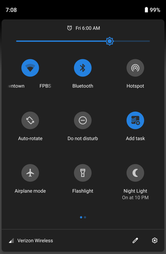
Back to polarizing changes, though: the status bar has been rearranged to better accommodate phones with notches (which apparently is going to be damn near all of them not made by Samsung). The time has been shifted over to the left of the screen and the little notification icons that appear over there are capped at four, whether you have a notch or not. It was a necessary step given the hardware trend, but I’m hoping that eventually, manufacturers will be able to report how much space their notch is taking up so Android can display more icons if there’s space for them. Google has changed the volume button behavior a bit — they only adjust media volume now with a little on-screen pop-up that lets you toggle your ringer between vibrate, silent, and on. It’s more predictable, and I think most people will prefer this behavior, but I’m an old person who actually adjusts ringer volume a lot, so it’s less convenient for me. ANDROID 9 PIE IS DESIGNED FOR NOTCHES, WHETHER YOUR PHONE HAS ONE OR NOT The other little pop-up on the right side is the power menu, with options for restarting and taking a screenshot. I recommend hunting down the “lockdown option” in settings, which adds another button to that menu. Tap it, and your phone will require a passcode instead of letting biometrics unlock the phone. Honestly, that button should have been set to “on” by default.

I’m not sure what took so long, but Android finally has a magnifier when you’re trying to move the cursor when selecting text. Another “finally” is a screenshot markup. When you take a screenshot now, you’ll have an option to crop it and draw on it before saving or sharing. Last but not least, if you’re the sort of person who leaves rotation lock on, Google will pop up a little button when you turn the phone to temporarily let you put it in landscape mode. Something about big phones has always caused them to be too aggressive at rotating the screen for me, so it’s a nice feature. It can be annoying, though: most of the time you want to go 90 (ahem) to watch the video, and video by default hides the main navigation buttons. It’s a few extra taps to get back to the portrait.

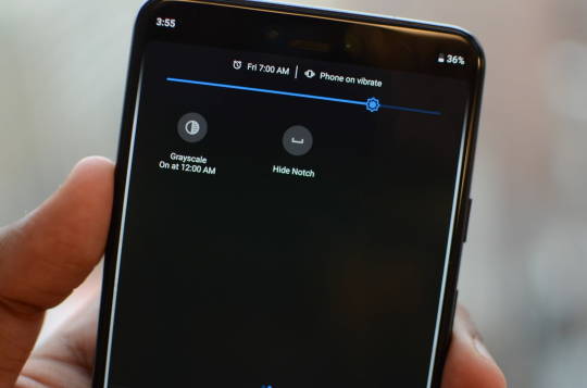
In my initial look at Android 9 Pie, I called it Google’s “most ambitious update in years.” I still think that’s true, but unfortunately, right now, Android doesn’t quite reach those ambitions. There are two key features that aren’t shipping until later this fall: the so-called “Digital Wellbeing” dashboard and a feature called Slices. Digital Wellbeing is available as a beta, and I’ll wait until it’s official to review it. But even in beta, it’s useful. You can see how much time you’re spending in apps, set limits, and turn on a great feature called “Wind down,” which toggles on Do Not Disturb and sets the screen to monochrome. Honestly, I wish there was a way to turn on Monochrome more easily anytime.
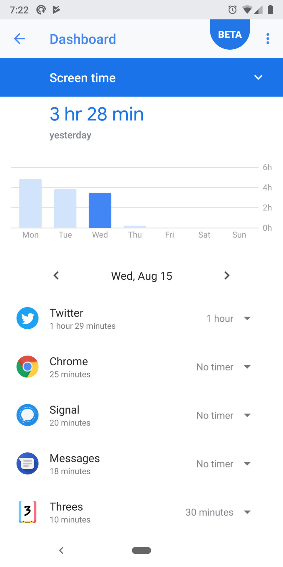
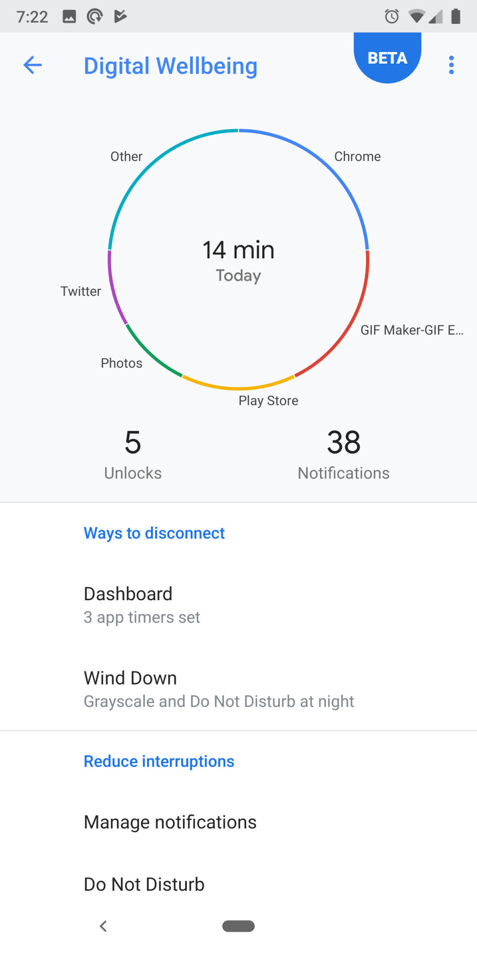
Do Not Disturb, by the way, has changed a little. It’s much more aggressive at hiding notifications by default, down to not letting you see them at all unless you mess with the settings or turn DND off. The default is a little overbearing for my tastes, and I wish there was a better middle ground. Slices are part of Google’s initiative to bring more AI and machine learning to Android’s interface. The idea is that the functions of an app can be “deconstructed” and spread out to other parts of the OS. So when you search for a thing you want to do, an app can show its own interface or button directly in the search results. The commonly cited example is hailing a car. We’ll test it in the fall when it becomes available. GOOGLE’S AI-BASED SUGGESTIONS ARE OFTEN EXACTLY WHAT YOU WANT TO DO NEXT But there are other AI elements to Android that are available right now. Both battery life and screen brightness are automatically handled by machine learning that adjusts settings based on your usage. I can’t really say how effective either are with any level of confidence, but anecdotally I do think I’ve been messing with screen brightness less often. AI also determines which icons appear at the bottom of the Overview screen, and it’s crazy good — the app I want to open next is there at least half the time. Finally, there’s “Actions,” a feature that complements Slices and is available now. Where Slices will show buttons for app actions when you actively search for something, Actions puts those buttons directly in your app drawer. As with those icons in the Overview screen, Android tries to guess what you might want to do, only here it’s a button that deep links into a part of the app. It might be sending a text or opening the podcasts app before you start your commute. They seem fine, but I’m not in the main app drawer often enough to make heavy use of them.
Android 9 Pie is a great update, and I wouldn’t want to go back. I love that it’s chock-full of ideas about how an operating system can be smarter, even though some of them (pardon the inevitable pun) don’t feel quite fully baked. I see a few trends beginning to come to fruition here. Through battery management and notification changes, Google is continuing its efforts to corral an ecosystem of bad-acting apps through a better-managed OS. The other big trend is one I’ve been talking about for a couple of years now: moving toward making AI the new UI. ANDROID 9 PIE IS FULL OF NEW IDEAS OF HOW AN OS CAN BE SMARTER Two years ago at the Code conference, CEO Sundar Pichai told Walt Mossberg that Google intended to be more “opinionated” about its own phones, and the Googlification of Android on Pixel phones is stronger than ever now. The heavy emphasis on the Overview screen, Actions, and (eventually) Slices are all examples of Google trying to use its own AI chops to surface what you need instead of making you hunt through home screen folders and apps. It’s been fascinating to compare Google’s strategy to Apple’s with iOS 12 — and will continue to be. Of course, if we’re bringing up iOS, we have to circle back to where we started: updates. Apple still trounces Android when it comes to getting phones updated to the latest OS. Last year, Google built the Treble infrastructure to make it easier for companies to push out these big OS updates faster. This year, I’d like to see more companies take advantage of it. Android users have more reason to hope than we have in a long time; the Essential Phone was the first non-Google phone I can remember that got an update the same day as Pixel phones. But that’s just one phone out of hundreds (or more). As happy as I am with all the individual features in Android 9 Pie, I’ll be even happier if the Android ecosystem gets its act together and releases it. Read the full article
0 notes
Text
June 7, 2020 AsktheBuilder Newsletter
This could be your first AsktheBuilder newsletter or it could be your 728th issue. If you’ve recently signed up, I welcome you. If you’re a subscriber in good standing, no matter how long you’ve been getting my missives, I’m glad you’re here too.
This is sort of a quirky issue. This week I’d like to share some random thoughts with you based on the requests for help I get at the Ask Tim page on AsktheBuilder.com.
But first, here’s this issue’s song. I love to listen to music while typing using the Dvorak method as I create this newsletter. CLICK or TAP HERE and enjoy this song with me. Get ready to Ooooo Ooooo Ooo Oooooo...
Treated Lumber Cracking
Two years ago, I started an experiment. I set out a short piece of treated 2x4 wood on a table on my deck. Over the past twenty-four months, it’s been in the direct sun and rain. It’s been covered with snow and ice, and scribbled on by my daughter while we played Yahtzee. BTW, if you want the dice to really jump around when you play Yahtzee, dump them in a clear 8x8 Pyrex glass pan that you might use for brownies. WOW, do the dice dance!
As part of the experiment, you should realize I didn’t seal this piece of treated wood. I wanted the wood to react to the elements so I could record an informative video that will save you lots of money and time.
CLICK or TAP HERE to watch this short video so you can PRESERVE your valuable treated lumber.
I’m willing to bet you three dark-chocolate Aglamesis pecandes that you discover something new about treated lumber and water that you didn’t know before. Are you willing to wager this sum? Will you make good on your debt if you lose?
The Fun Quiz!
Ask yourself what these things have in common:
wrestling
piece of lumber
special bow tie
vegetable
tuxedo trim
Probe your tiny gray cells and delight in discovering how intelligent you are, yet none of your friends but me give you credit! Rest assured that if you and I lived in the same house I’d duly note your intelligence but realize I’d also playfully rib you about your dopey mistakes. Yes, turnabout is fair play!
CLICK or TAP HERE NOW and be amazed!
Vickie’s Frustration
Just two days ago, Vickie stopped by the website. Here’s what she wrote:
“Hi, Tim,
We are researching adding a shed to our backyard in Columbus, Ohio. For the life of me, I can not find shed specifications - maximum size without a permit and how to site near property lines - set forth by the city. I've googled and googled and searched through city building and zoning code without luck. I've called and couldn't get anyone to answer. Any suggestions?”
I wonder how you’d answer this. Imagine Vickie building a shed something like this one near a rear property line:
My first reaction was that Vickie should be congratulated for trying her best to search out the information.
Here’s what she did right. She went online and tried to find the City of Columbus Zoning Code. I did too, and within twenty seconds I located the correct page that was the entry point to the zoning codes.
I then used the search feature and came back with some juicy results. I’m quite sure with a little digging, I’d come out with the needed information.
But where did Vickie go wrong? In my opinion, deciding to call the office in hopes of getting the needed information was a mistake.
My advice to her was to make an appointment and then get on a bus or drive down to the office and talk to a zoning official in person.
Why is it important to go in person to the zoning office? Riddle me this:
How much do you think your shed will weigh and how easy would it be to move? If you get incorrect verbal information and are challenged by a neighbor after your new shed is built, how are you going to move the shed to the correct location?
You get one chance to get it right. You don’t want to do it over.
I’d want to walk out of the office with copies showing in black and white exactly where the shed can go. Person-to-person contact can make all the difference.
Nina from South America
It’s always fun to get international requests for help. It happens more often than you might imagine.
Nina wrote to me:
“I live in a hot and humid country with a rainy season. Builders here do not flash windows, so when we built our house 5 years ago, our windows were not flashed. Our house was built with clay blocks and was then plastered with cement. The windows are single pane with an aluminum frame.
They were screwed into the concrete. When the rain falls, it goes from the windows down the walls. We’re not sure how to fix the problem
Most likely we would have to import any materials we would need, seeing how flashing of windows is not really done here. I am not a fan of liquid flashing, as all the liquid/silicone products (from reputed) brands I have used around the house do not hold up well in our climate (in merely a matter of months they start to peel, crack, ...).
What would our options be? Taking out the windows? And then?
Thank you in advance for your guidance!”
It just so happens that a few days before, I had put in a new outdoor hose bib here at my house.
I recorded a video of the process. The hose bib is mounted to a block that rests on the wall and the lap siding butts into it.
In many respects, it’s very much like a window.
I sent Nina to THIS PAGE and asked her to watch the video to get a handle on how I flashed the block. I don’t know that I’ve seen another video out there like this nor anyone else doing it this way.
Too many people rely on caulk as a remedy. That’s a huge mistake.
CLICK or TAP HERE and watch this video. I’m pretty convinced it will open your eyes to what you need to do or what you need to make sure your builder or remodeler does.
Pay CLOSE ATTENTION to the caption of the screenshot PHOTO that has two curved red arrows. Here it is so you recognize it once you are at the page:
As I was recording the video, I failed to notice a HUGE CLUE that I wish I would have talked about in the video!!! Look at what the red arrows point to. Engage your critical-thinking skills.
Epic Mudslide
My college major was geology and I graduated from the University of Cincinnati. You wouldn’t think that Cincinnati would be at the center of the geology vortex, but it is.
Two things are quite notable about Cincinnati:
It’s the world type section for Upper Ordovician stratigraphy and fossils. Geologists from across the world come to Cincinnati to study and collect fossils.
It has or used to have, the highest per-capita damage anywhere in the USA for landslides. California gets all the press from its dramatic mudslides, but the Kope and Lower Fairview formations in Cincinnati are far more destructive.
Would you like to see your house slide into the ocean or river? I didn’t think so.
Did you know you can AVOID buying a house that’s built in a danger zone? It’s not hard to do.
CLICK or TAP HERE and see what happened in Alta, Norway, a few days ago. It’s heart-sickening.
That’s enough for a Sunday, right?
Tim Carter Founder - www.AsktheBuilder.com SOLD OUT BEST Cleaner! - www.StainSolver.com Talk With Strangers! - www.W3ATB.com
Do It Right, Not Over!
P.S. Tell me something. How would you make a RAPID repair of a BIG HOLE in drywall?
Would you do it this way? CLICK or TAP HERE.
The post June 7, 2020 AsktheBuilder Newsletter appeared first on Ask the Builder.
from Home https://www.askthebuilder.com/june-7-2020-askthebuilder-newsletter/ via http://www.rssmix.com/
0 notes
Text
June 7, 2020 AsktheBuilder Newsletter
This could be your first AsktheBuilder newsletter or it could be your 728th issue. If you’ve recently signed up, I welcome you. If you’re a subscriber in good standing, no matter how long you’ve been getting my missives, I’m glad you’re here too.
This is sort of a quirky issue. This week I’d like to share some random thoughts with you based on the requests for help I get at the Ask Tim page on AsktheBuilder.com.
But first, here’s this issue’s song. I love to listen to music while typing using the Dvorak method as I create this newsletter. CLICK or TAP HERE and enjoy this song with me. Get ready to Ooooo Ooooo Ooo Oooooo...
Treated Lumber Cracking
Two years ago, I started an experiment. I set out a short piece of treated 2x4 wood on a table on my deck. Over the past twenty-four months, it’s been in the direct sun and rain. It’s been covered with snow and ice, and scribbled on by my daughter while we played Yahtzee. BTW, if you want the dice to really jump around when you play Yahtzee, dump them in a clear 8x8 Pyrex glass pan that you might use for brownies. WOW, do the dice dance!
As part of the experiment, you should realize I didn’t seal this piece of treated wood. I wanted the wood to react to the elements so I could record an informative video that will save you lots of money and time.
CLICK or TAP HERE to watch this short video so you can PRESERVE your valuable treated lumber.
I’m willing to bet you three dark-chocolate Aglamesis pecandes that you discover something new about treated lumber and water that you didn’t know before. Are you willing to wager this sum? Will you make good on your debt if you lose?
The Fun Quiz!
Ask yourself what these things have in common:
wrestling
piece of lumber
special bow tie
vegetable
tuxedo trim
Probe your tiny gray cells and delight in discovering how intelligent you are, yet none of your friends but me give you credit! Rest assured that if you and I lived in the same house I’d duly note your intelligence but realize I’d also playfully rib you about your dopey mistakes. Yes, turnabout is fair play!
CLICK or TAP HERE NOW and be amazed!
Vickie’s Frustration
Just two days ago, Vickie stopped by the website. Here’s what she wrote:
“Hi, Tim,
We are researching adding a shed to our backyard in Columbus, Ohio. For the life of me, I can not find shed specifications - maximum size without a permit and how to site near property lines - set forth by the city. I've googled and googled and searched through city building and zoning code without luck. I've called and couldn't get anyone to answer. Any suggestions?”
I wonder how you’d answer this. Imagine Vickie building a shed something like this one near a rear property line:
My first reaction was that Vickie should be congratulated for trying her best to search out the information.
Here’s what she did right. She went online and tried to find the City of Columbus Zoning Code. I did too, and within twenty seconds I located the correct page that was the entry point to the zoning codes.
I then used the search feature and came back with some juicy results. I’m quite sure with a little digging, I’d come out with the needed information.
But where did Vickie go wrong? In my opinion, deciding to call the office in hopes of getting the needed information was a mistake.
My advice to her was to make an appointment and then get on a bus or drive down to the office and talk to a zoning official in person.
Why is it important to go in person to the zoning office? Riddle me this:
How much do you think your shed will weigh and how easy would it be to move? If you get incorrect verbal information and are challenged by a neighbor after your new shed is built, how are you going to move the shed to the correct location?
You get one chance to get it right. You don’t want to do it over.
I’d want to walk out of the office with copies showing in black and white exactly where the shed can go. Person-to-person contact can make all the difference.
Nina from South America
It’s always fun to get international requests for help. It happens more often than you might imagine.
Nina wrote to me:
“I live in a hot and humid country with a rainy season. Builders here do not flash windows, so when we built our house 5 years ago, our windows were not flashed. Our house was built with clay blocks and was then plastered with cement. The windows are single pane with an aluminum frame.
They were screwed into the concrete. When the rain falls, it goes from the windows down the walls. We’re not sure how to fix the problem
Most likely we would have to import any materials we would need, seeing how flashing of windows is not really done here. I am not a fan of liquid flashing, as all the liquid/silicone products (from reputed) brands I have used around the house do not hold up well in our climate (in merely a matter of months they start to peel, crack, ...).
What would our options be? Taking out the windows? And then?
Thank you in advance for your guidance!”
It just so happens that a few days before, I had put in a new outdoor hose bib here at my house.
I recorded a video of the process. The hose bib is mounted to a block that rests on the wall and the lap siding butts into it.
In many respects, it’s very much like a window.
I sent Nina to THIS PAGE and asked her to watch the video to get a handle on how I flashed the block. I don’t know that I’ve seen another video out there like this nor anyone else doing it this way.
Too many people rely on caulk as a remedy. That’s a huge mistake.
CLICK or TAP HERE and watch this video. I’m pretty convinced it will open your eyes to what you need to do or what you need to make sure your builder or remodeler does.
Pay CLOSE ATTENTION to the caption of the screenshot PHOTO that has two curved red arrows. Here it is so you recognize it once you are at the page:
As I was recording the video, I failed to notice a HUGE CLUE that I wish I would have talked about in the video!!! Look at what the red arrows point to. Engage your critical-thinking skills.
Epic Mudslide
My college major was geology and I graduated from the University of Cincinnati. You wouldn’t think that Cincinnati would be at the center of the geology vortex, but it is.
Two things are quite notable about Cincinnati:
It’s the world type section for Upper Ordovician stratigraphy and fossils. Geologists from across the world come to Cincinnati to study and collect fossils.
It has or used to have, the highest per-capita damage anywhere in the USA for landslides. California gets all the press from its dramatic mudslides, but the Kope and Lower Fairview formations in Cincinnati are far more destructive.
Would you like to see your house slide into the ocean or river? I didn’t think so.
Did you know you can AVOID buying a house that’s built in a danger zone? It’s not hard to do.
CLICK or TAP HERE and see what happened in Alta, Norway, a few days ago. It’s heart-sickening.
That’s enough for a Sunday, right?
Tim Carter Founder - www.AsktheBuilder.com SOLD OUT BEST Cleaner! - www.StainSolver.com Talk With Strangers! - www.W3ATB.com
Do It Right, Not Over!
P.S. Tell me something. How would you make a RAPID repair of a BIG HOLE in drywall?
Would you do it this way? CLICK or TAP HERE.
The post June 7, 2020 AsktheBuilder Newsletter appeared first on Ask the Builder.
from Real Estate https://www.askthebuilder.com/june-7-2020-askthebuilder-newsletter/ via http://www.rssmix.com/
0 notes
Text
June 7, 2020 AsktheBuilder Newsletter
This could be your first AsktheBuilder newsletter or it could be your 728th issue. If you’ve recently signed up, I welcome you. If you’re a subscriber in good standing, no matter how long you’ve been getting my missives, I’m glad you’re here too.
This is sort of a quirky issue. This week I’d like to share some random thoughts with you based on the requests for help I get at the Ask Tim page on AsktheBuilder.com.
But first, here’s this issue’s song. I love to listen to music while typing using the Dvorak method as I create this newsletter. CLICK or TAP HERE and enjoy this song with me. Get ready to Ooooo Ooooo Ooo Oooooo...
Treated Lumber Cracking
Two years ago, I started an experiment. I set out a short piece of treated 2x4 wood on a table on my deck. Over the past twenty-four months, it’s been in the direct sun and rain. It’s been covered with snow and ice, and scribbled on by my daughter while we played Yahtzee. BTW, if you want the dice to really jump around when you play Yahtzee, dump them in a clear 8x8 Pyrex glass pan that you might use for brownies. WOW, do the dice dance!
As part of the experiment, you should realize I didn’t seal this piece of treated wood. I wanted the wood to react to the elements so I could record an informative video that will save you lots of money and time.
CLICK or TAP HERE to watch this short video so you can PRESERVE your valuable treated lumber.
I’m willing to bet you three dark-chocolate Aglamesis pecandes that you discover something new about treated lumber and water that you didn’t know before. Are you willing to wager this sum? Will you make good on your debt if you lose?
The Fun Quiz!
Ask yourself what these things have in common:
wrestling
piece of lumber
special bow tie
vegetable
tuxedo trim
Probe your tiny gray cells and delight in discovering how intelligent you are, yet none of your friends but me give you credit! Rest assured that if you and I lived in the same house I’d duly note your intelligence but realize I’d also playfully rib you about your dopey mistakes. Yes, turnabout is fair play!
CLICK or TAP HERE NOW and be amazed!
Vickie’s Frustration
Just two days ago, Vickie stopped by the website. Here’s what she wrote:
“Hi, Tim,
We are researching adding a shed to our backyard in Columbus, Ohio. For the life of me, I can not find shed specifications - maximum size without a permit and how to site near property lines - set forth by the city. I've googled and googled and searched through city building and zoning code without luck. I've called and couldn't get anyone to answer. Any suggestions?”
I wonder how you’d answer this. Imagine Vickie building a shed something like this one near a rear property line:
My first reaction was that Vickie should be congratulated for trying her best to search out the information.
Here’s what she did right. She went online and tried to find the City of Columbus Zoning Code. I did too, and within twenty seconds I located the correct page that was the entry point to the zoning codes.
I then used the search feature and came back with some juicy results. I’m quite sure with a little digging, I’d come out with the needed information.
But where did Vickie go wrong? In my opinion, deciding to call the office in hopes of getting the needed information was a mistake.
My advice to her was to make an appointment and then get on a bus or drive down to the office and talk to a zoning official in person.
Why is it important to go in person to the zoning office? Riddle me this:
How much do you think your shed will weigh and how easy would it be to move? If you get incorrect verbal information and are challenged by a neighbor after your new shed is built, how are you going to move the shed to the correct location?
You get one chance to get it right. You don’t want to do it over.
I’d want to walk out of the office with copies showing in black and white exactly where the shed can go. Person-to-person contact can make all the difference.
Nina from South America
It’s always fun to get international requests for help. It happens more often than you might imagine.
Nina wrote to me:
“I live in a hot and humid country with a rainy season. Builders here do not flash windows, so when we built our house 5 years ago, our windows were not flashed. Our house was built with clay blocks and was then plastered with cement. The windows are single pane with an aluminum frame.
They were screwed into the concrete. When the rain falls, it goes from the windows down the walls. We’re not sure how to fix the problem
Most likely we would have to import any materials we would need, seeing how flashing of windows is not really done here. I am not a fan of liquid flashing, as all the liquid/silicone products (from reputed) brands I have used around the house do not hold up well in our climate (in merely a matter of months they start to peel, crack, ...).
What would our options be? Taking out the windows? And then?
Thank you in advance for your guidance!”
It just so happens that a few days before, I had put in a new outdoor hose bib here at my house.
I recorded a video of the process. The hose bib is mounted to a block that rests on the wall and the lap siding butts into it.
In many respects, it’s very much like a window.
I sent Nina to THIS PAGE and asked her to watch the video to get a handle on how I flashed the block. I don’t know that I’ve seen another video out there like this nor anyone else doing it this way.
Too many people rely on caulk as a remedy. That’s a huge mistake.
CLICK or TAP HERE and watch this video. I’m pretty convinced it will open your eyes to what you need to do or what you need to make sure your builder or remodeler does.
Pay CLOSE ATTENTION to the caption of the screenshot PHOTO that has two curved red arrows. Here it is so you recognize it once you are at the page:
As I was recording the video, I failed to notice a HUGE CLUE that I wish I would have talked about in the video!!! Look at what the red arrows point to. Engage your critical-thinking skills.
Epic Mudslide
My college major was geology and I graduated from the University of Cincinnati. You wouldn’t think that Cincinnati would be at the center of the geology vortex, but it is.
Two things are quite notable about Cincinnati:
It’s the world type section for Upper Ordovician stratigraphy and fossils. Geologists from across the world come to Cincinnati to study and collect fossils.
It has or used to have, the highest per-capita damage anywhere in the USA for landslides. California gets all the press from its dramatic mudslides, but the Kope and Lower Fairview formations in Cincinnati are far more destructive.
Would you like to see your house slide into the ocean or river? I didn’t think so.
Did you know you can AVOID buying a house that’s built in a danger zone? It’s not hard to do.
CLICK or TAP HERE and see what happened in Alta, Norway, a few days ago. It’s heart-sickening.
That’s enough for a Sunday, right?
Tim Carter Founder - www.AsktheBuilder.com SOLD OUT BEST Cleaner! - www.StainSolver.com Talk With Strangers! - www.W3ATB.com
Do It Right, Not Over!
P.S. Tell me something. How would you make a RAPID repair of a BIG HOLE in drywall?
Would you do it this way? CLICK or TAP HERE.
The post June 7, 2020 AsktheBuilder Newsletter appeared first on Ask the Builder.
from Home https://www.askthebuilder.com/june-7-2020-askthebuilder-newsletter/ via http://www.rssmix.com/
0 notes
Text
June 7, 2020 AsktheBuilder Newsletter
This could be your first AsktheBuilder newsletter or it could be your 728th issue. If you’ve recently signed up, I welcome you. If you’re a subscriber in good standing, no matter how long you’ve been getting my missives, I’m glad you’re here too.
This is sort of a quirky issue. This week I’d like to share some random thoughts with you based on the requests for help I get at the Ask Tim page on AsktheBuilder.com.
But first, here’s this issue’s song. I love to listen to music while typing using the Dvorak method as I create this newsletter. CLICK or TAP HERE and enjoy this song with me. Get ready to Ooooo Ooooo Ooo Oooooo...
Treated Lumber Cracking
Two years ago, I started an experiment. I set out a short piece of treated 2x4 wood on a table on my deck. Over the past twenty-four months, it’s been in the direct sun and rain. It’s been covered with snow and ice, and scribbled on by my daughter while we played Yahtzee. BTW, if you want the dice to really jump around when you play Yahtzee, dump them in a clear 8x8 Pyrex glass pan that you might use for brownies. WOW, do the dice dance!
As part of the experiment, you should realize I didn’t seal this piece of treated wood. I wanted the wood to react to the elements so I could record an informative video that will save you lots of money and time.
CLICK or TAP HERE to watch this short video so you can PRESERVE your valuable treated lumber.
I’m willing to bet you three dark-chocolate Aglamesis pecandes that you discover something new about treated lumber and water that you didn’t know before. Are you willing to wager this sum? Will you make good on your debt if you lose?
The Fun Quiz!
Ask yourself what these things have in common:
wrestling
piece of lumber
special bow tie
vegetable
tuxedo trim
Probe your tiny gray cells and delight in discovering how intelligent you are, yet none of your friends but me give you credit! Rest assured that if you and I lived in the same house I’d duly note your intelligence but realize I’d also playfully rib you about your dopey mistakes. Yes, turnabout is fair play!
CLICK or TAP HERE NOW and be amazed!
Vickie’s Frustration
Just two days ago, Vickie stopped by the website. Here’s what she wrote:
“Hi, Tim,
We are researching adding a shed to our backyard in Columbus, Ohio. For the life of me, I can not find shed specifications - maximum size without a permit and how to site near property lines - set forth by the city. I've googled and googled and searched through city building and zoning code without luck. I've called and couldn't get anyone to answer. Any suggestions?”
I wonder how you’d answer this. Imagine Vickie building a shed something like this one near a rear property line:
My first reaction was that Vickie should be congratulated for trying her best to search out the information.
Here’s what she did right. She went online and tried to find the City of Columbus Zoning Code. I did too, and within twenty seconds I located the correct page that was the entry point to the zoning codes.
I then used the search feature and came back with some juicy results. I’m quite sure with a little digging, I’d come out with the needed information.
But where did Vickie go wrong? In my opinion, deciding to call the office in hopes of getting the needed information was a mistake.
My advice to her was to make an appointment and then get on a bus or drive down to the office and talk to a zoning official in person.
Why is it important to go in person to the zoning office? Riddle me this:
How much do you think your shed will weigh and how easy would it be to move? If you get incorrect verbal information and are challenged by a neighbor after your new shed is built, how are you going to move the shed to the correct location?
You get one chance to get it right. You don’t want to do it over.
I’d want to walk out of the office with copies showing in black and white exactly where the shed can go. Person-to-person contact can make all the difference.
Nina from South America
It’s always fun to get international requests for help. It happens more often than you might imagine.
Nina wrote to me:
“I live in a hot and humid country with a rainy season. Builders here do not flash windows, so when we built our house 5 years ago, our windows were not flashed. Our house was built with clay blocks and was then plastered with cement. The windows are single pane with an aluminum frame.
They were screwed into the concrete. When the rain falls, it goes from the windows down the walls. We’re not sure how to fix the problem
Most likely we would have to import any materials we would need, seeing how flashing of windows is not really done here. I am not a fan of liquid flashing, as all the liquid/silicone products (from reputed) brands I have used around the house do not hold up well in our climate (in merely a matter of months they start to peel, crack, ...).
What would our options be? Taking out the windows? And then?
Thank you in advance for your guidance!”
It just so happens that a few days before, I had put in a new outdoor hose bib here at my house.
I recorded a video of the process. The hose bib is mounted to a block that rests on the wall and the lap siding butts into it.
In many respects, it’s very much like a window.
I sent Nina to THIS PAGE and asked her to watch the video to get a handle on how I flashed the block. I don’t know that I’ve seen another video out there like this nor anyone else doing it this way.
Too many people rely on caulk as a remedy. That’s a huge mistake.
CLICK or TAP HERE and watch this video. I’m pretty convinced it will open your eyes to what you need to do or what you need to make sure your builder or remodeler does.
Pay CLOSE ATTENTION to the caption of the screenshot PHOTO that has two curved red arrows. Here it is so you recognize it once you are at the page:
As I was recording the video, I failed to notice a HUGE CLUE that I wish I would have talked about in the video!!! Look at what the red arrows point to. Engage your critical-thinking skills.
Epic Mudslide
My college major was geology and I graduated from the University of Cincinnati. You wouldn’t think that Cincinnati would be at the center of the geology vortex, but it is.
Two things are quite notable about Cincinnati:
It’s the world type section for Upper Ordovician stratigraphy and fossils. Geologists from across the world come to Cincinnati to study and collect fossils.
It has or used to have, the highest per-capita damage anywhere in the USA for landslides. California gets all the press from its dramatic mudslides, but the Kope and Lower Fairview formations in Cincinnati are far more destructive.
Would you like to see your house slide into the ocean or river? I didn’t think so.
Did you know you can AVOID buying a house that’s built in a danger zone? It’s not hard to do.
CLICK or TAP HERE and see what happened in Alta, Norway, a few days ago. It’s heart-sickening.
That’s enough for a Sunday, right?
Tim Carter Founder - www.AsktheBuilder.com SOLD OUT BEST Cleaner! - www.StainSolver.com Talk With Strangers! - www.W3ATB.com
Do It Right, Not Over!
P.S. Tell me something. How would you make a RAPID repair of a BIG HOLE in drywall?
Would you do it this way? CLICK or TAP HERE.
The post June 7, 2020 AsktheBuilder Newsletter appeared first on Ask the Builder.
from builders feed https://www.askthebuilder.com/june-7-2020-askthebuilder-newsletter/ via http://www.rssmix.com/
0 notes
Link
Hi. This is a post for everyone still using traditional adsense ads on their sites or intend to monetize their sites with ads someday. I see positive mentions of Ezoic every once in a while on this sub but I feel none of the posts on this sub so far explain elaborately about Ezoic or its potential to a layperson unfamiliar with Ezoic or dabbling with Adsense for the first few times. And that is evident by the questions & dilemmas that pop up as posts & comments from time to time on this sub regarding Adsense and Adsense alternatives like Ezoic, Adthrive and Mediavine (adsense parters actually) when it comes to non-affiliate monetization methods.This post details my experience with using Ezoic on my sites so far and an AMA of sorts because there seems to be a lot of doubts and questions that you guys have when it comes to Ezoic. So feel free to ask. There are not many detailed reviews of these platforms on the Internet besides a mention by bloggers posting how they are making big bucks from these platforms in their monthly income reports. So I have documented my experience with Ezoic so far which spans a little over a year and I have attached screenshots where I've felt necessary but feel free to demand more. I do have an experience of using Adsense a couple of years until then but overall I still consider myself a beginner so I am always open to suggestions and criticisms.CASE STUDIES:I currently have three websites running in three separate niches and all of them run Ezoic ads. Combined they make me around $500-$800 a month. I cannot estimate what significance an extra $500 to $800 of income a month holds to first worlders but for someone like me who comes from the third world and with that sweet conversion rate, that income let's me live a happy life the way I want to without having to resort to a soul crushing 80 hour work week or occasionally life-threatening work and for that I will forever be grateful to Ezoic because without them it would not have been possible for me to make an earning & living online.Here's my personal income report from Ezoic so far. Ezoic earns me 4x to 8x the revenue from my sites compared to what having plain regular Adsense ads on them would earn me.On site A where I used to earn $1.25 per thousand views on Adsense, I now earn $5 - $8 for the same number of views on Ezoic. This site is in the niche of women's style and fashion. This is one of my very first sites and not a very proud one. I hired cheap writers and this is a buzzfeed style listicle website.On site B, I directly put on Ezoic and I get between $10-$12 per thousand views. This site is in the education niche. This site is way cleaner, good SEO and I have written the content myself. I was pretty happy with the jump in revenue I saw for the previous site so I never bothered with Adsense for this one. I directly applied to Ezoic for this. Got approved quick and had Ezoic running on it. Unlike the previous site, this site has been set to run 'balanced' number of ads, that is fewer ads on it. So getting $10-12 EPMV on it makes me more than happy. (EPMV = earnings per mille [thousand] visitors)On site C where I used to earn $0.25 per thousand views under Adsense, I now earn over $2 for the same thousand views thanks to Ezoic. This site is in the children's and parenting niche. I consider this site a failure for two reasons. I chose a bad niche with low ad rates and a third world majority audience. Because this means that even if I get a 100,000 views, I can only make say $200 dollars from this site. Second, the site despite being good in quality seems to be struck down by the recent Google update and the traffic has tanked hard and I'm making next to nothing on this. We'll I learned important lesson atleast and it doesnt cause any losses of time and money to run so will come back to this site later in 2020. But despite this, I'm glad with the jump that Ezoic has provided for this site because the revenue despite being low, jumped from $0.25 to $2. Confirming my faith in Ezoic.Why I joined Ezoic in the first placeI feel those numbers by themselves are a good no reason why anyone using Adsense currently should immediately upgrade to Ezoic. But for me one of my main reasons to join Ezoic was to not infringe on Google policies and have my Adsense banned. If you remember up until the longest time barring the past few years, Google had a restriction of 3 or 4 ad units to be placed atmost on a webpage. Google was kind enough to lift this restriction but was a bit vague by saying that the ads need to be proportional to the amount of content that is present on the webpage. Which makes sense but I always found myself second guessing as to whether I have too many ads on my page and risked getting banned or too few and risked leaving potential revenue on the table.This is where Ezoic stepped in. You just select all the prominent placements on your site where you could put ads and Ezoic uses its algorithm to decide the appropriate number of ads per page and incessantly tests the number of units, placement and sizes of the ads to test which gives the maximum revenue while still adhering to all Google policies and guidelines. Manually A/B testing Adsense ads was also a big problem and simply not feasible for me. I knew I was leaving revenue on the table by not constantly A/B testing my ads back when I was with Adsense but was too lazy and it was simply not feasible for me time-wise to test it out. Maybe some Adsense experts on here would know of ways to A/B test just using the Adsense dashboard and a few shortucts but for someone like me it would be days of work, months of tracking, hundreds of ad units and still I would be constantly doubting myself. Ezoic now automates that entire process for me.And that's pretty much it. Just a fantastic platform which uses its algorithms to completely automate your ad testing and tweaking which not only increases but multiplies your revenue for you. I will answer some common questions that have come up on this sub so far.What are the requirements and how difficult is the sign up process?They require your site to have atleast 10,000 visits per month. Visits and not pageviews. And second, to be overall compliant by Adsense standards and policies. If you meet this requirement, just sign up and soon someone from Ezoic's side will get in touch. They will verify your analytics and you will set up either using Ezoic's Wordpress plugin or by pointing your site's nameservers to Ezoic. They will also provide you an account manager to help you out with anything.Am I bound to them by contract? Do I have to sign a contract?No. No contract and you're not required to sign anything. You can discontinue any moment you feel like.Payments?Paypal, US Bank Transfer via Payoneer, International Bank Transfer via Payoneer, Prepaid Card via Payoneer, Check (Rec. USA and Canada Only).How does it compare to Mediavine and Adthrive?So for the unaware, Mediavine and Adthrive are also Google ad partners offering similar services. I have no experience working with either Mediavine or Adthrive though. I applied to Mediavine on three separate instances for two different sites but was rejected all the three times. Adthrive supposedly is even more tougher to get approved for. So my opinion on them is from what I have heard and read so far.Mediavine: Mediavine has a traffic requirement of 25,000/sessions per month and a US majority traffic. Ezoic has a requirement of only 10,000/session per month and doesn't demand a US majority traffic. Mediavine seems to be a better fit for female blogger niches like gourmet, writing, crafts, ettiquetes etc but also extends to travel, budgeting, online business etc. From dozens and dozens of Mediavine income reports that I have read, they seem to pay around $10-$15 per thousand visits. Since, my site B with US majority traffic earns in the same range, it seems to be at par with Mediavine. Here is what I would recommend to everyone so far. Apply to Ezoic the moment your site crosses 10,000 sessions and have them up and running on your site. Once your site crosses 25,000 visits you can apply to Mediavine if you feel your Ezoic EPMV is not good enough.Adthrive: Adthrive has a traffic requirement of 100,000/pageviews per month and from what I heard it seems even tougher to get qualified than Mediavine. They also have a waiting period of a couple of months and if I'm not wrong require you to get in a contract with them and require a 30 day notice before their ads be removed from your site. Out of the three, Adthrive will put the most number of ads on the site. From what I have read so far from in blogger's income reports, it seems Adthrive pays less than what Mediavine pays. So with these conditions, it doesn't make much sense to join Adtrive.What is Ezoic customer service like?The customer service is phenomenal and unparalleled. For a platform that deals with AI, I'm shocked at how good their customer service is and no I have not been paid to say this. Whenever I have contacted them on their general email for any support, I have got back a reply within a few minutes to a few hours but never longer than that. Never have I had to even wait a day. Each account is also provided an account manager who assists at literally everything. My previous account manager would reply almost instantly whenever I contacted him for support but there have been delays with the new account manager assigned to me. Sometimes taking a couple of days or more for a reply. But overall I would say the humans working at Ezoic are fantasticAmazon affiliate vs Ezoic/ad based sitesThat would be a separate post altogether. I feel the disdain for ad based sites is reasonable. I have made a post in the past saying how I feel the revenue I'm generating is quite less compared to the traffic I am getting. And hence I myself am looking to gravitate more towards affiliate sites or having my own products. But at the same time, not all sites can link to affiliate products. For a lot of sites, ads are the only option. This post is for them. Or for those currently using adsense on their sites. Or for those getting a decent traffic on their website but not high enough affiliate conversions.What else?There is a seasonal change in revenue. The EPMV varies month by month. Usually the ad rates are low in the beginning of a quarter and then shoot up towards the end. Christmas is usually the time of the year with the highest ad rates so right now is a good time for you to join in, although somewhere around October would have been even better because by then your initial testing would have been over and you could have cashed in on the high ad rates for Christmas. Nonetheless, now is still a good time to join in. You will notice sharp fall in ad rates in Jan and Feb though but it picks up again after that.Initial testing period: When you install Ezoic ads for the first time, there will be a period of a week or two where the algorithm will try out various permutations and combinations of ads to see which ones performs the best. During this period, your revenue will lower and not a true reflection of what you could be making with Ezoic once everything is optimized. It would still be multiple times more than what you were making with Adsense but speaking from my experience it should nearly double once everything is optimized in the coming weeks.Lot of free and useful one-click apps: Their 'app store' has a great bunch of free one-click-install tools that I found to be very useful. From displaying the privacy policy disclaimers to adding ads.txt or the placeholders for the ads, everything can be done with one click installs. Really useful.CiaoI guess that's about it. When I started out a year ago with them, besides an occasional mention in blogger's income report, there was literally maybe one single review post about Ezoic on the entire Internet. So just wanted to do my part and help out any fellow blogger's still using traditional Adsense ads on their blogs or websites. If you have any questions, please ask them below and at the same time let me be transparent and do a plug. If you found this post useful please consider signing up using my referral link. (I will get a tiny recurring bonus each month).In return, I will personally answer all your questions and also do my best to help you set up with Ezoic. Ezoic sign up hereThanks.
0 notes
Text
How to Quickly Sell a Car on Craigslist
Price, Appearance, and Description Are Vital to a Good Craigslist Sale
Selling a car on Craigslist can be an easy and rewarding experience. Most likely you will save yourself about $2,000 more than a trade-in at the dealership or at the local CarMax. If you do a little research to appropriately price your car, write a descriptive online advertisement and thoroughly clean your car, you can sell it quickly, usually within 48 hours. Since new ads are posted constantly on Craigslist, it is advantageous for the seller to sell in a day or two, before it gets buried too far down the list.
How to Determine Your Car's Value
Kelley Blue Book or Edmunds.com are great online resources to help determine the worth of a used car. They consider the region in which you are selling, the make, model, year, mileage and all the features of your car. The website easily guides you by asking you questions. When you are finished with their quiz, it lists all your car's features and the value based on the condition of the car. You can even print it out and have it with you to negotiate with a potential buyer.
Once you have a suggested price from Kelley Blue Book or Edmunds, go to Craigslist and see what your Competition looks like. Search for your make and model of car to see what similar cars are listed for and how many listings you are competing with. This will help you sanity check your price. Once you have a figure in mind, price your car about $500 higher, so you have room to negotiate. Remember, cars that are priced to sell quickly are usually right at or just under the Kelley Blue Book recommendation.
Official Kelley Blue Book New & Used Car Values Let Kelley Blue Book help you find the right car today! Begin your car search and go direct to kbb.com, The Trusted Resource. What's your car worth?
New Cars, Used Cars, Car Reviews and Pricing - Edmunds.com Edmunds car buying guide lists new car prices, used car prices, car comparisons, car buying advice, car ratings, car values, auto leasing.
Screenshot of Kelly Blue Book Quiz | Source
Source
Use Craigslist to quickly sell you car | Source
Place Your Ad in Classifieds on Craigslist
After you have completed your research to price your car, cleaned the car and taken pictures, then you are ready to post your ad on Craigslist. Open the website and select your city or metro area. Next click "post to classifieds." When selecting the type of posting, be sure to click on "cars by owner." You will be prompted to write your ad describing your car. Be as descriptive as possible. Use the list of features on the Kelley Blue Book tool. Be sure to add anything important, like if you recently replaced a transmission or if the car has a new set of tires. Be honest in describing your car. It will save you and potential buyers a lot of time if you are accurate in your description.
Before final posting, Craigslist will want to verify your ad to make sure it is legitimate. It will send you an email with instructions on how to further edit or post your ad. It is important to save this email in case you want to change your ad in the future. Craigslist will keep your listing for 45 days.
Take Pictures of Your Car
Tires with good tread | Source
Craigslist allows you to download eight images for your listing. Make sure to take good digital pictures that feature your car at its best. Take the pictures on a sunny day. Be sure to take photos of the exterior and interior. If your car has tires that are new or in very good condition, feature a picture of the tread on tires. Loading the pictures on Craigslist can be time-consuming, but it is far better to feature them with your ad then have to email them to potential buyers when they want to see them.
Be Careful of Scams on Craigslist
Be smart when buying or selling on Craigslist. Make sure you select the email address that shows up anonymously to the viewers. Don't list your phone number on Craigslist. Do not accept personal checks and be sure money orders are legit. Also, don't show your car alone. Make sure someone else is with you. If you do not want someone coming to your home, meet at a public place. A bank parking lot is ideal. Depending upon your state, you may need a notary to sign your title transfer anyway. If the buyer wants to test drive the car, make sure he leaves his license and keys with you as collateral. Be safe!
Clean Your Car Before Selling It
Your car has to look impeccable before you try to sell it. You wouldn't want to buy something that looks old and dirty, would you? If the competition in your area for selling used cars is tough, your car's appearance could mean the difference in a sale.
Start with the inside. Throw away the trash. Empty the console. Clean the dash, consoles, cup holders and steering wheel with a good cleaner like Armor All. Use a water and white vinegar solution to clean the grime and fingerprints off the glass without streaking. Empty the contents of your glove box except for the owner's manual. Remove any CDs or DVDs from the car.
Wash and wax the exterior of the car. Buff the car really well so it shines like new (or as good as it can get). Shine the wheel covers too. Once the car is all clean, park it in the garage if possible.
What Happens If the Car Doesn't Sell Quickly?
If your car has been listed for more than a week on Craigslist and you haven't gotten any inquiries, it is likely that your price is too high for what you are selling. Reevaluate your price and your ad description, then refresh your ad, so it moves to the top of the list on Craigslist. If after two weeks it hasn't sold, pull the ad, wait a couple of weeks and list it again. If it is priced right, it will sell!
Craigslist: An Easy Way to Buy and Sell
What Items Have You Bought or Sold on Craigslist?
A Used Car
Tickets
Furniture
Toys
Sports Gear
Other
See results
See results
Texas Auto Value or Craigslist?
Texas Auto Value and Craigslist are both viable options to sell your car. Of the two, Texas Auto Value is definitely the easiest option, if you are willing to sell for less than the value. When I sold my Toyota Sienna, the car was eight years old. CarMax priced it $1,000 less than my dealer trade-in offer and $3,000 less than what I sold it for on Craigslist. And, it sold in 48 hours on Craigslist. The key to success? Price it fairly, clean it thoroughly and write a descriptive ad. Also, list the ad on a Thursday or Friday since most people will have more time to shop on the weekend.
Easy Checklist to Sell Car on Craigslist
Task
Complete
Remove personal belongings
Gather service records
Clean car exterior
Clean car interior
Obtain car title
Do research on competition
Determine car value
Take pictures
Write ad on Craigslist
Check email or messages often
This article is accurate and true to the best of the author’s knowledge. Content is for informational or entertainment purposes only and does not substitute for personal counsel or professional advice in business, financial, legal, or technical matters.
#HowToSellCar#TexasAutoValue#@TexasAutoValue TAVPerformance#TexasAuto#trucksforsale#ramforsale#FordTrucks#ChevyTrucks
0 notes
Text
Amanda Seyfried Apologizes to Arielle Charnas For Supporting a Body-Shaming Message Against Her
ICYMI: Earlier this week, influencer Arielle Charnas posted mirror selfie while wearing a bikini. The shot showed off her toned stomach, and the caption reads, “Proud of my body after two kids.”
Amanda Seyfried’s friend commented on the post, calling out the mom for promoting her “unhealthy body image.” Seyfried shared a screenshot of the comment to her own Instagram feed with a lengthy caption explaining how a “semi-influencer” (assumed to be Charnas) had blocked both Seyfried and her friend. Seyfried wrote that she was upset because by blocking them, this influencer wouldn’t engage in conversation.
RELATED: Kelsey Wells Posts Before-and-After Photo to Show How Exercise Healed Her Postpartum Depression
Seyfried received plenty of flak from her fans, many of whom believed that by sharing the post, she supported the overly-critical message her friend wrote.
On Thursday, Seyfried responded to the situation in an Instagram post. She shared a photo of Robert Frost’s quote, “Education is the ability to listen to almost anything without losing your temper or your self-confidence.”
RELATED: Mom of 3 Bares All on Instagram by Sharing Unedited Photo of Postpartum Stomach Wrinkles
“To all who feel bullied or thin-shamed during our recent social media discussion: If you know me or are familiar with any of my beliefs or stances you’ll recognize that it isn’t in my character to tear down anyone for ‘being who they are,’” she wrote. “Each of us has the ability and the freedom to say and do as we choose. However, as I’m acutely aware, there’s a price tag for the group of people who find themselves with a platform to stand on.”
Seyfried said that she believes people with influence need to be able to respond to criticism and be held accountable for the messages they send. However, she apologized about how she handled the situation and to the unnamed influencer.
RELATED: This Influencer Posed With Her Stomach Out to Make an Important Point About Postpartum Bodies
“The only thing I’d take back is exactly how I started this debate. I desperately wish it hadn’t targeted (or blasted) one person (there are MANY who engage in this questionable messaging) and instead started a cleaner, general conversation,” she wrote. “No one needs to tear anyone apart. And I regret that it’s present right now. To the lady in question: I’m sorry for the truly negative feels you’ve endured because of this.”
“Aside from the messy detour? The bigger, important message seems to filtering through and helping a lot of women feel supported. And that’s the name of the game,” she added.
To get more real talk on everything body positivity, sign up for the Real Wellness WomenIRL newsletter
source https://www.health.com/mind-body/amanda-seyfried-arielle-charnas-apology
0 notes